3 easy eco-design principles to make your digital product more sustainable
Ana Schlienger18 min read

At Theodo, one of our core values is pragmatism, which means getting things done well - without wasting time, energy, or money. There is no better embodiment of pragmatism than sustainability.
The carbon footprint of the tech industry will reach 8% of global emissions in 2025 (it is around 5% today), which is about the same as air travel. People are trying to reduce their emissions linked to air travel, so why wouldn’t we do the same for tech?
It goes without saying that we don’t want to cut out tech and the Internet. However, we can use them in a more mindful and responsible way - this is digital sobriety - buying less-powerful machines, replacing them less frequently, and not using energy-intensive approaches where possible.
As a tech company, we can be an example of sustainability. In addition to reducing our carbon footprint, acting responsibly will also get us stronger engagement from our collaborators, improve the company’s image, and become a great source of savings by reducing useless expenses.
What is sustainable tech?
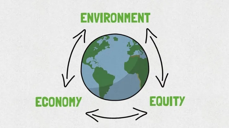
Sustainability, according to the UN, consists of fulfilling the needs of current generations without compromising the needs of future generations, while ensuring a balance between economy, environmental care, and social well-being.
Sustainable technology is a broad term that encompasses two concepts: technology that has been designed specifically to remedy or prevent environmental issues and technology that has been produced with sustainability in mind. We are going to focus on the second part.
To achieve this, we apply the three pillars of sustainability to different aspects of our tech product:
- Eco-design for the environmental dimension: the products we conceive should be designed to have the smallest possible impact in terms of resource consumption (raw materials as well as electricity)
- Accessibility for the social dimension: make the product available and easy to use for everyone, taking into account possible disabilities (sight, motor skills, language)
- Quality to reduce technical debt and unnecessary costs: a higher-quality product lasts longer, requires less maintenance, and is more energy-efficient.
The good thing is that these pillars work together. If you make something more energy efficient, it will most likely reduce its costs. If a product is more user-friendly, it will probably last longer because of strong user engagement and feedback.
By working and doing everything through these principles, studies led in France and Europe [2] proved that we can reduce the number of resources we use by a factor of 2 to 100 (instead of using 1000 GWh of energy, we could only be using between 10 and 500 GWh - the same applies for water, electricity, CO2 emissions).
Make your tech product more sustainable - effective and valuable actions
As a tech company, we need to consider the product(s) we deliver at every stage of their lifecycle, from conception to fabrication, and then final use. It is easier to split the problem step by step than to try to fix little bits here and there. [3] - that is why we will focus on improving each step of this lifecycle:
- Reduce the environmental impact from the conception
- Reduce the number of computer resources needed (terminal power, bandwidth, number of servers)
- Extend the lifespan of users’ terminals (no need for constantly renewing the devices)
The first step is conception
It works the same as with a disease: we want to prevent it at its source instead of treating the symptoms.
Optimize the user experience
why: The time spent by the user on their terminal is the second most important factor in terms of the environmental impact of the tech industry (right after the fabrication of devices), according to the International Energy Agency [1]. Optimizing the user path means reducing the time the user spends on the most common functionalities.
how: Target the most frequent paths and optimize them: reduce the number of steps, and actions, identify the cases of failure, and optimize the response time… A user flow is well designed when the program behaves exactly as the user imagined it would. Surveying users, testing, and getting feedback is the best way to identify friction points - situations or interactions that contribute to degrading the user experience and slowing down the journey. Working with UX designers is the safest way to achieve the best results.
Remove useless features
why: The more an interface is rich and complex, the more it will weigh and consume energy. In the Chaos Report 2015 of Standish Group, it is pointed out that 70% of the functionality requested by users are not essential and 45% of them are never or rarely used.
By reducing the coverage and functional depth of the application, we reduce its initial development cost, its technical debt, and the associated environmental impact. This reduces the infrastructure required to run the application. It also makes the app easier to use, which improves the user experience.
The objective here is to determine the usefulness of each feature. This can be done during the conception phase but is also a continuous process, which consists of analyzing usage data of each feature within your app.
how: A good approach is that if more than 5% of your users use a feature, it is useful and should remain. Otherwise, it might be a good thing to rethink and refactor it, and if it is truly not useful to your users, discontinue it.
Again, working with the users (MoSCoW method, workshops, wireframes, user tests) is the best way to verify the usefulness of some functionality before its development.
Prefer static websites for non-dynamic content
why: Have a static website will reduce bandwidth, CPU cycles, bandwidth, and power consumption.
The use of a dynamic content management system requires the user terminal to load the different software layers to deliver the content requested by the Internet user: the HTTP server, the application server, the database, possibly the associated cache systems, etc. In contrast, a static file is directly read and sent back to the user by the HTTP server or the cache server, without soliciting the application server or the database.
how: As always, adapt the solution to your product.
If a page only needs to be modified twice a year, prefer static pages, it can be built outside the CMS. For a landing page or a simple showcase site, create a static site in HTML, CSS, and JS. For a blog with little activity, or of small size, create a static site generated via a Jamstack (CloudCannon, Hugo, Next SSG, etc.) administered, if necessary, via a headless CMS or a headless flat-file CMS (Prismic, Contentful, etc.) For a more complex website or web app, make the pages with a low modification rate (FAQ, About, legal mentions, etc.) static by using frameworks (Next, Nuxtjs, etc.). Read this article on how to build a showcase website with Netlify, Nuxtjs, and Contentful.
Then, there is the fabrication step
The conception part of the development process involves the technical team but relies on designers and users too. Here, for the fabrication part, it is all up to the technical team to make choices.
Meet the performance standards
why: An app or a website with a higher complexity (many features, pages, complicated user flow) implies more CPU consumption and therefore more energy consumption; but above all, it slows down the experience for the user which causes frustration that can push them to change devices.
how: We want to make sure that the app is compatible with older OSs (accessibility: everyone can use it), and to test it with a less powerful computer (you can use BrowserStack or the throttling tool in your browser dev tools).
The goal is that all pages have a Lighthouse Performance score as high as possible - above 90 - (the lighthouse score reflects the performance of your app. An app with only the necessary features (sober, no surplus) is likely to be a performant app).
Prefer standard fonts
why: They are already present on the user’s computer, so there is no need to download them. This saves bandwidth and speeds up the display of the site.
how: Pick from the list of standard fonts (Courier New, Arial, Comic, Impact, Times New Roman, Verdana, …). Google Fonts also provides a huge catalog of optimized fonts.
However, we might need a particular font for our digital service. In this case, even if it is an API font, best practices are to:
- prefer a font variable if more than one font is needed (e.g. regular, bold, etc.), by defining the
@font-facevariable in a stylesheet. - optimize the font by removing unnecessary characters (e.g. an American website only needs Latin characters, so the Cyrillic alphabet can be removed)
Use vector images when possible
why: Always prefer vector images or jpeg (if no alpha channel is required), as files are smaller while keeping excellent quality. This can reduce the download size of these images by up to 75%.
how: Most SVG images contain a lot of metadata that was necessary to create them (layer information, comments, etc.), which is necessary to edit the image, but not necessary to display it. Removing them reduces the file size. Many minification and optimization tools, such as Compressor.io or SVGO are available.
Don’t resize images on the browser side
why: For non-vector assets, you should optimize your asset size according to what is needed by your app. By resizing your assets, their weight will be reduced, and they will load faster on user devices.
In any case, the browser doesn’t do all that good a job of resizing images, in part because a pixel is basically a pixel; if it has to render 500 pixels of data in a 400-pixel space, it has to effectively interpolate the image based on the data it has, and the result generally results in a blurry picture.
how: For non-vector images: if your app will display an image of 60px*30px, no need to use a bigger one. Resize it before using it, instead of setting its dimension in the code. You can do this manually using an image editor, or more realistically through your CMS or hosting provider. Imgix, Vercel, Netlify and other services offer automatic tools that will generate the images at the size they are used.
Reduce the number of images and use lazy loading
why: By loading resources only when needed on your app, you not only reduce the data being transferred but also improve the speed, reactivity, and overall user experience of your app.
When you replace images by CSS styling, the weight of a stylesheet will be much lower than those images, especially if it is compressed. Moreover, the call of a stylesheet generates only one HTTP request, against a large number if you use many images (one HTTP request for each image).
Also, it is a good practice to implement lazy loading.
how: Sobriety is always the key. Use CSS properties instead of images: there is no need to download extra images where you can use a color background or a CSS property. Ex: the rounded corners of the boxes must be managed with CSS rather than with images. The same applies to color-block backgrounds.
Lazy loading:
- quickly:
bad:
<img src="veryHeavy.png"/>good:<img src="veryHeavy.png" loading="lazy"/> - full documentation here
- using the framework-provided image elements usually comes with lazy loading.
Don’t overuse libraries and frameworks and reduce the bundles’ size
why: JavaScript libraries such as jQuery and ready-to-use CSS frameworks (Bootstrap, skeleton, Gumby, foundation…) are excellent tools for quickly building websites, as they meet almost all common needs. On the other hand, we usually use only a small portion of them; as their architecture is not modular, it forces the user to download the entire library to use only a few of its features.
As with most recommendations, the goal is to avoid transiting unused code files through the network, in order to alleviate the CPU load by keeping only the necessary code.
how: Split the code in chunks (lazy loading); these chunks only contain chunks from external packages that are actually used. Finally, the downloaded chunks on a page should only contain the pages and components used on that page. A nice tool is Webpack Bundle Analyzer - it helps you find out what is really inside your bundle, what modules make up the most of their size, detect modules that got there by mistake and optimize it.
Using a bundler (e.g. Webpack) allows you to eliminate “dead” code that is not used.
Instead of using libraries and frameworks, you can use the vanilla JS implementation wherever possible (replace jQuery). It will not only help reduce emissions but also provide superior code quality. You can also make sure you only keep the portions of code that are really used (custom Bootstrap build).
Use CSS containment
why: The principle of CSS Containment is to make a node and its content independent from the rest of the page tree. The browser then only recalculates the rendering for the single independent node instead of the entire DOM of the page. Moreover, only the content in the visible area is rendered.
Depending on the value of the contain property (strict, content, size, layout, style, and/or paint), and on the components’ independence, the browser will reload only a specific part of the code/page.
how: Specify the independent sections in your code.
independent {
  contain: content;
}
Read the full developer doc to find which property is more suited for each element.
Avoid SQL queries inside loops
why: SQL queries within loops pose big performance problems, especially if the SQL server is not on the local machine. These servers are optimized to process several selections, insertions, or modifications in a single query or transaction. If not used properly, these queries consume unnecessary CPU cycles, RAM, and bandwidth.
how: For example, don’t make a loop with inserts inside, but rather prepare all the data to be inserted and do it in a single query.
// bad
foreach ($userList as $user) {
    $query = 'INSERT INTO users (first_name,last_name) VALUES("'. $user['first_name'] .'", "'. $user['last_ name'] .'")';
    mysql_query($query);
}

// good
$userData = array();
foreach ($userList as $user) {
    $userData[] = '("'. $user['first_name'] .'", "'.
    $user['last_name'] .'")';
}
$query = 'INSERT INTO users (first_name,last_name) VALUES'. implode(',', $userData); mysql_query($query);
The same applies to selections and modifications.
Do not automatically start playing videos
why: The automatic activation of videos (auto-play) when loading web pages implies using resources on each third party (terminal, network, datacenter). In many cases, auto-play is not necessary. In addition, it attracts the user’s attention and can detract from the service that was requested.
how: Therefore, these playbacks should be done at the user’s request whenever possible by not setting the autoplay attribute in the <video> tag.
Also, even if auto-play is not enabled, parts of the video file may be downloaded. If the user does not start playing the video, this data will be downloaded unnecessarily. In this case, you should force the browser to not preload anything by setting the value of the preload attribute of the <video> tag to none.
<video src="video-file-source" preload="none"></video>
Finally, while the product is in use
Once our software is created and out on the market, it will consume resources. The environment in which it lives and how it is delivered to the user can have a huge impact on its electricity and resource consumption.
Use a CDN (Content Delivery Network)
why: Some files - such as libraries, style sheets, images, etc. - consume a lot of network resources because they are generally numerous and small in size. This is why you should use CDNs, which physically bring these files closer to end users, thus generating a significant gain in bandwidth consumption and a better response time.
A good side effect is that a properly configured CDN may also help protect websites against some common malicious attacks, such as DDoS attacks.
how: Google provides CDNs that already host the commonly used JavaScript libraries. (There are other options, such as AWS Cloudfront, Cloudflare…)
However, there may be cases where the use of a CDN is irrelevant. When the target is very localized (e.g. regional), it is more appropriate to use local and quality hosting.
Here again, it is about making the most sensible choice.
Properly size your servers - or go serverless
why: Correctly dimensioning your servers allows you to avoid unnecessary overconsumption compared to the real need. When it comes to serverless, cloud energy is more efficient in terms of easy scaling and cost-effectiveness.
how: Choose the correct server architecture that fits the needs of your product. If the traffic is constant, have them properly sized. If not, then use autoscaled servers or serverless.
Is better to have an auto-scaled next setup or better to use serverless?
Serverless is good to decrease go-to-market time and build lightweight and flexible applications. It deals well with inconsistent usage (peak periods VS little traffic), reduces latency, and brings the code closer to users. (read more about Serverless)
Classic servers are a better fit for large applications with a fairly constant, predictable workload. It is recommended for long-running processes (as serverless charges for the amount of time the code is running) and might be more convenient for legacy apps that are hard to migrate.
(AWS) Use S3 Intelligent-Tiering
why: The Amazon S3 Intelligent-Tiering storage class is designed to optimize storage costs by automatically moving data to the most cost-effective access tier when access patterns change. For a small monthly object monitoring and automation charge, S3 Intelligent-Tiering monitors access patterns and automatically moves objects that have not been accessed to lower-cost access tiers. S3 Intelligent-Tiering delivers automatic storage cost savings in three low-latency and high-throughput access tiers.
how: Learn how to configure your buckets.
lifecycleRules: [
	{
		transitions: [
			{
				storageClass: StorageClas.INTELLIGENT_TIERING,
				transitionAfter: Duration.days(0),
			},
		],
	},
],
(AWS) Run your Lambda code on an arm64 architecture instead of x86_64
why: Since 2021, AWS Graviton2 processors are available for AWS Lambda; they are designed to deliver up to 19% better performance at 20% lower cost (tested and approved). With the development effort being minimal, it is easy to migrate to an ARM setup as fast as possible.
how: To check which architecture you are using, connect to the lambda service and inspect the code tab ⇒ runtime settings. The value is arm64 for Graviton2 processors.
If you use Serverless ≥ v3, provisioned lambdas are arm64 by default. Otherwise, you can use the architecture property:
functions: myFunction: handler: my_function.handler;
architectures: arm64;
Test your AWS configurations and implement AWS best practices
why: There are more good practices when it comes to AWS than only the ones listed in this article, and you might already have some implemented. You can quickly test the current status of your AWS stacks and then even make sure these practices are periodically checked using Guardian by Kumo [4]. This tool will prevent problems from occurring and optimize your app’s performance and costs.
how: Again, this does not mean that you have to follow every rule, but do what makes the most sense for your app. The documentation here helps you run the test and also explains each rule and how to make your stack compliant. But mostly, you can simply use these two lines:
yard add -D @kumo-by-theodo/guardian
yarn guardian -p {YOUR_AWS_PROFILE} -c {YOUR_AWS_STACK_NAME} -r {YOUR_AWS_REGION}
Is it worth the effort? What can we achieve through sustainable tech?
One of the goals of sustainability is to reduce the company and its products’ environmental impact. A responsible policy reduces resource consumption and thanks to that, lowers costs by 20 to 40%, depending on where you start. If all tech companies were to follow eco-design practices, we could reduce the carbon footprint of the digital sector by 25 to 50%.
Concretely, if we manage to reduce server loads/needs by 50% [2], reduce the data that flows through the network by 20%, and increase the lifespan of user devices by 40%, then, in 2025, we could reduce the usage of:
- energy by 20 % (1967 less Twh)
- GHG by 19 % (422 billion kg eq. CO2)
- water by 25 % (2699 fewer million m3)
- electricity by 18% (349 less Twh)
Beyond sustainability, eco-design practices come with other benefits for a software company, including:
- It is a source of savings by contributing to reducing useless expenses.
- It improves the company’s image. Having a visible, sustainable policy and responsible practices show that we care. This might be important for some clients and investors.
- Collaborators are more engaged. More and more, employees express the desire to work for a company that is driven by sustainability.
- It helps anticipate future laws on digital sobriety. Maybe we don’t see it coming today, but tech, like all other industries, will be required to lower its carbon emissions.
Final note
Being sustainable should not be seen as a constraint but as an opportunity. Instead of waiting for government regulations, resource crises, or social pressure, we can proactively address the issue. As a company and as individuals, we can create digital products and services that are better - more sustainable, more innovative - than those of our competitors, notably through eco-design approaches.
Go further
- Calculate the carbon footprint of your website here, then work on it, and recalculate it.
- Do an audit of your website! Theodo offers a Serverless Sustainability Audit and an overall App Audit.
- Measure the server-side impact of your application with PowerAPI**.**
Sources:
[1] World Energy Outlook Report, 2022, International Energy Agency.
[2] Empreinte environmental du numérique mondial, 2019, Frédéric Bordage, PDF.
[3] collectif.greenit.fr
[4] Guardian by Kumo