Create resizeable split panels in React
Mansur Pasha10 min read

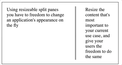
Resizable containers empower different users to customize a UI to emphasise what they find most important. A basic implementation of this is a split view or split pane, allowing users to enlarge content that is more relevant to them.
There are libraries that can implement this feature for you, but creating it yourself gives you full control over the styling and functionality, so you can rapidly tailor it to your project. The full feature can be done in under 150 lines, with no dependencies, and in my case it was faster to add to my project than using a third-party library. It’s also a component that covers a wide range of the features React has to offer, which is great for quickly getting to grips with what the library can do.
You can find the finished component right here.
(Credit to Seif Ghezala for the initial inspiration I’ve expanded on in this article)
Getting started
Creating the component
Let’s start out by creating a functional component. We want to be able to pass in the content to be displayed in each panel, so let’s go ahead and pass in the LeftContent and RightContent as props, and wrap them in styled div so they’re displayed side by side.
import React from "react";

interface SplitViewProps {
  left: React.ReactElement;
  right: React.ReactElement;
}

export const SplitView: React.FunctionComponent<SplitViewProps> = ({
  left,
  right,
}) => {
  return (
    <div className="splitView">
      {left}
      {right}
    </div>
  );
};
.splitView {
  height: 100%;
  display: flex;
  flex-direction: row;
  align-items: flex-start;
}
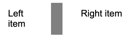
Now let’s add the divider. I’m going to keep things simple and just use a div with a margin. The width will be fixed at a few pixels, and I want the height to grow with the content in the panels either side, which we can do with height 100%.
  return (
    <div className="splitView">
      {left}
      <div className="divider"/>
      {right}
    </div>
  );
.divider {
  width: 2px;
  height: 100%;
  margin: 1rem;
  border: 2px solid #808080;
}
Alright here’s our basic component set up.
Now for the fun part!
Time to start resizing
So the end goal is to click and drag the divider and resize both panels accordingly. The trick here is to resize just one of the panels, and then let flex-grow and flex-shrink take care of the other.
Let’s control the panel on the left. We’re going to need a way of storing and setting its width so we can create some state for our component using the useState hook.
const [leftWidth, setLeftWidth] = useState<undefined | number>(undefined);
The panel on the left is going to have quite a bit of its own functionality so lets move that div into its own new component called LeftPanel. We want it to use the state we just created so lets pass in leftWidth and the setter too.
const LeftPanel: React.FunctionComponent<{
  leftWidth: number | undefined;
  setLeftWidth: (value: number) => void;
}> = ({ children, leftWidth, setLeftWidth }) => {

  return <div>{children}</div>;
};
Time for the magic. The ref!
React refs allow us to access the properties of elements in the DOM. If we use it on the div around our left panel content, we’ll be able to both get and set the width of it directly.
To use refs, first create one using React’s createRef function. Then attach it to the desired element using the ref property.
  const leftRef = createRef<HTMLDivElement>();
  return <div ref={leftRef}>{children}</div>;
By doing this, the properties of that element are now accessible under leftRef.current.
Time to connect our state and the ref with another React hook, useEffect. First we want to make sure that if our state isn’t defined it gets initialized to the width of the left panel.
Then we want to make sure that whenever our state changes, we change the width of the left panel too. We can access the width using current.clientWidth.
const LeftPanel: React.FunctionComponent<{
  leftWidth: number | undefined;
  setLeftWidth: (value: number) => void;
}> = ({ children, leftWidth, setLeftWidth }) => {
  const leftRef = createRef<HTMLDivElement>();

  React.useEffect(() => {
    if (leftRef.current) {
      if (!leftWidth) {
        setLeftWidth(leftRef.current?.clientWidth);
        return;
      }

      leftRef.current.style.width = `${leftWidth}px`;
    }
  }, [leftRef, leftWidth, setLeftWidth]);

  return <div ref={leftRef}>{children}</div>;
};
Now whenever we change the leftWidth state in our original SplitView component, it will change the width of the left panel!
Notice the array after the contents of the useEffect. That dependency array makes sure that the code in the effect runs whenever either of those values change.
So we could do the same thing for the right panel, but as I said before, we can make things much simpler by giving it flex-grow (here I’ve used the shorthand flex: 1).
export const SplitView: React.FunctionComponent<SplitViewProps> = ({ left, right}) => {
  const [leftWidth, setLeftWidth] = useState<undefined | number>(undefined);
  return (
    <div className="splitView">
      <LeftPanel leftWidth={leftWidth} setLeftWidth={setLeftWidth}>
        {left}
      </LeftPanel>
      <div className="divider"/>
      <div className="rightPane">{right}</div>
    </div>
  );
};
.rightPane {
  flex: 1;
}
Now wasn’t that easier?
We’re all set to resize both of our panels. We just need something to trigger it.
Getting the mouse involved
We want to resize our panels when we click and drag the separator. We can break that down into 3 stages:
- Clicking down on the separator
- Dragging the mouse
- Releasing the separator
Conveniently, we can capture each of these stages with 3 mouse events;
- onMouseDown: Set a flag to start tracking mouse movements. Store the initial position of the mouse at this moment.
- onMouseMove: If the flag is set, track the mouse’s horizontal position, and resize the left panel accordingly
- onMouseUp: Clear the flag
Let’s start with onMouseDown. When the user clicks on the separator, we want to store the mouse’s horizontal position at that moment, and set a flag to start tracking any horizontal movement after that. Sounds like we need some more useState hooks.
  const [separatorXPosition, setSeparatorXPosition] = useState<undefined | number>(undefined);
  const [dragging, setDragging] = useState(false);
Then we can create our onMouseDown function. We want to trigger this when we click on the separator, so let’s add our onMouseDown event to the divider.
  const onMouseDown = (e: React.MouseEvent) => {
    setSeparatorXPosition(e.clientX);
    setDragging(true);
  };


  return (
    <div className="splitView">
      <LeftPanel leftWidth={leftWidth} setLeftWidth={setLeftWidth}>
        {left}
      </LeftPanel>
      <div className="divider" onMouseDown={onMouseDown}/>
      <div className="rightPane">{right}</div>
    </div>
  );
Next up is the onMouseMove event. If the flag isn’t set we can just return. If the flag is set, then we’re going to want to update leftWidth. The value to modify leftWidth by is the mouse’s current position minus the stored mouse position. All we need to do is add that value to the leftWidth using the setter. We update the stored mouse position as well, so we can repeat this event for as long as the user is dragging the slider.
  const onMouseMove = (e: React.MouseEvent) => {
    if (dragging && leftWidth && separatorXPosition) {
      const newLeftWidth = leftWidth + e.clientX - separatorXPosition;
      setSeparatorXPosition(e.clientX);
      setLeftWidth(newLeftWidth);
    }
  };
To trigger this function, we need event listeners. We can add those to the document using document.addEventListener. If we create a new useEffect for our SplitView component, then the listener will be added when the component mounts. As an added bonus we can return a function in the useEffect, which is run when the component unmounts, to remove the eventListeners and clean up after ourselves.
  useEffect(() => {
    document.addEventListener('mousemove', onMouseMove);
    return () => {
     document.removeEventListener('mousemove', onMouseMove);
    };
  });
Alright almost there. Finally we just need an onMouseUp function to reset the flag. We’ll add eventListeners to the document for onMouseUp events too.
  const onMouseUp = () => {
    setDragging(false);
  };
  useEffect(() => {
    document.addEventListener('mousemove', onMouseMove);
    document.addEventListener('mouseup', onMouseUp);

    return () => {
     document.removeEventListener('mousemove', onMouseMove);
     document.removeEventListener('mouseup', onMouseUp);
    };
  });
And we’re done! Congratulations… but at the moment this component just gets a passing grade from me. Let’s see what we can do to make it nicer.
Improving the component
Adding maximum and minimum widths
Because otherwise the component is really easy to break by losing the divider out of bounds and not being able to click on it.
To stop the divider from doing this, let’s add a minimum width for our panels with a const (if you wanted to get fancy you could pass it in as a prop). Then we just need a bit of extra logic in our onMouseMove function.
const MIN_WIDTH = 50;

  const onMouseMove = (e: React.MouseEvent) => {
    if (dragging && leftWidth && separatorXPosition) {
      const newLeftWidth = leftWidth + e.clientX - separatorXPosition;
      setSeparatorXPosition(e.clientX);

      if (newLeftWidth < MIN_WIDTH) {
        setLeftWidth(MIN_WIDTH);
        return;
      }

      setLeftWidth(newLeftWidth);
    }
  };
So that takes care of the left edge, but what about the right? Well if we had the width of the whole component then we could calculate a maximum width for the left panel and use the logic above. Now how could we access the width of our component…
That’s right, using another ref! Let’s attach it to the div wrapping all our components.
const splitPaneRef = createRef<HTMLDivElement>();
...
  return (
    <div ref={splitPaneRef} className="splitView">
      <LeftPanel leftWidth={leftWidth} setLeftWidth={setLeftWidth}>
        {left}
      </LeftPanel>
      <div className="divider" onMouseDown={onMouseDown}/>
      <div className="rightPane">{right}</div>
    </div>
  );
Now our onMouseMove logic becomes:
  const onMouseMove = (clientX: number) => {
    if (dragging && leftWidth && separatorXPosition) {
      const newLeftWidth = leftWidth + clientX - separatorXPosition;
      setSeparatorXPosition(clientX);

      if (newLeftWidth < MIN_WIDTH) {
        setLeftWidth(MIN_WIDTH);
        return;
      }

      if (splitPaneRef.current) {
        const splitPaneWidth = splitPaneRef.current.clientWidth;

        if (newLeftWidth > splitPaneWidth - MIN_WIDTH) {
          setLeftWidth(splitPaneWidth - MIN_WIDTH);
          return;
        }
      }

      setLeftWidth(newLeftWidth);
    }
  };
Perfect, no more disappearing dividers.
What is this? A divider for ants?
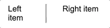
It’s not ideal that our user has to click on an area 2 pixels wide if they want to resize the panels. Maybe we could make it wider?
That looks terrible. How about padding it a little with another div?
  return (
    <div className="container">
      <LeftPanel leftWidth={leftWidth} setLeftWidth={setLeftWidth}>
        {left}
      </LeftPanel>
      <div className="divider-hitbox" onMouseDown={onMouseDown}>
        <div className="divider"/>
      </div>
      <div className="rightPane">{right}</div>
    </div>
  );
.divider-hitbox {
  cursor: col-resize;
  align-self: stretch;
  display: flex;
  align-items: center;
  padding: 0 1rem;
}
Muuuuch better. Changing the cursor also makes it much clearer to the user that this is resizeable!
This is really important for touch screens where 2 pixel precision isn’t going to make you many friends.
But none of my touch screen users can use the feature!
That’s right! Because we only added mouse events. We’re going to need some touch events too!
TouchEvents are pretty similar to mouseEvents so we can reuse most of our code. But since touch screens can support many touches at once, touchEvents store an array of touches. Each touch has its own x and y positions, so we need to tweak our functions a little to account for this.
  const onTouchStart = (e: React.TouchEvent) => {
    setSeparatorXPosition(e.touches[0].clientX);
    setDragging(true);
  };

  const onMove = (clientX: number) => {
    if (dragging && leftWidth && separatorXPosition) {
      const newLeftWidth = leftWidth + clientX - separatorXPosition;
      setSeparatorXPosition(clientX);

      if (newLeftWidth < MIN_WIDTH) {
        setLeftWidth(MIN_WIDTH);
        return;
      }

      if (splitPaneRef.current) {
        const splitPaneWidth = splitPaneRef.current.clientWidth;

        if (newLeftWidth > splitPaneWidth - MIN_WIDTH) {
          setLeftWidth(splitPaneWidth - MIN_WIDTH);
          return;
        }
      }

      setLeftWidth(newLeftWidth);
    }
  };

  const onMouseMove = (e: MouseEvent) => {
    if (dragging) e.preventDefault();
    onMove(e.clientX);
  };

  const onTouchMove = (e: TouchEvent) => {
    onMove(e.touches[0].clientX);
  };

  const onMouseUp = () => {
    setSeparatorXPosition(undefined);
    setDragging(false);
  };

  useEffect(() => {
    document.addEventListener('mousemove', onMouseMove);
    document.addEventListener('touchmove', onTouchMove);
    document.addEventListener('mouseup', onMouseUp);

    return () => {
      document.removeEventListener('mousemove', onMouseMove);
      document.removeEventListener('touchmove', onTouchMove);
      document.removeEventListener('mouseup', onMouseUp);
    };
  });

  return (
    <Container ref={splitPaneRef} className={className}>
      <LeftPanel leftWidth={leftWidth} setLeftWidth={setLeftWidth}>
        {left}
      </LeftPanel>
     <div
        className="divider-hitbox"
        onMouseDown={onMouseDown}
        onTouchStart={onTouchStart}
        onTouchEnd={onMouseUp}
      >
        <div className="divider" />
      </div>
      <div className="rightPane">{right}</div>
  );
};
We can move out the core logic of the onMouseMove function into one shared onMove function that both the onTouchMove and onMouseMove functions can use. Also note that we use the onTouchStart and onTouchEnd events, both attached to the Separator, and reuse the onMouseUp function for onTouchEnd.
One last note is the addition of e.preventDefault if dragging is true in onMouseMove. This stops text being highlighted (or other onDrag mouse events from being triggered) while moving the divider around.
That’s great! Can I style it too?
You can! The final touch to our component will be adding a className prop. Drop the component anywhere in your project and style it to your heart’s content using your method of choice, whether it be stylesheets, styled-components or something else.
interface SplitViewProps {
  left: React.ReactElement;
  right: React.ReactElement;
  className?: string;
}

export const SplitView: React.FunctionComponent<SplitViewProps> = ({ left, right, className }) => {
...
  return (
    <div ref={splitPaneRef} className={`splitView ${className ?? ""}`}>
>
Happy resizing!
(Cover photo by Fabrizio Verrecchia on Unsplash)