Build your own stickers component with react-konva
Sarah Hamilton8 min read

Konva.js is an awesome HTML5 Canvas JavaScript framework that enables high performance animations for desktop and mobile applications.
The framework’s capabilities are useful and versatile - it can be integrated for many different and varied use cases. Konva.js deals well with touch genstures, drag and drop and animations to name just a few!
To see the breadth of the konva.js framework see the konva.js demos page.
React-Konva

React-Konva allows us to work with both React applications and Konva.js together seamlessly.
Here we’ll create draggable stickers which can be deleted, suitable for both desktop and mobile applications. There are great react-native stickers libraries out there, however there really aren’t many libraries to implement it in a react app. Therefore, react-konva is a great solution!
Show me the code!
Check out my code sandbox for the demo here!
Let’s get started…
Adding a konva image
Let’s take this tutorial through step-by-step. We need a canvas to add our stickers to. We’ll add an image here to replicate a selfie, the sticker’s most common use case.
import React from "react";
import { Image as KonvaImage, Layer, Stage } from "react-konva";
import useImage from "use-image";

export default function App() {
  const [image] = useImage("example-image.png");

  return (
    <Stage width={500} height={500}>
      <Layer>
        <KonvaImage image={image} />
      </Layer>
    </Stage>
  );
}
What is going on here?
- The
useImagehook handles loading the image - The
Stageacts as our canvas - The
Layeris tied to the canvas element and can contain Groups, Shapes and Images - The
KonvaImageacts like animgtag and allows us to display our image

Photo by Moose Photos from Pexels
Aside: When I was building this for a photobooth experience I utilised the react-html5-camera-photo library to take the photo that we used as the image in the canvas, but let’s stick to the stickers for now 👀
Creating the sticker button
Let’s add a button with our desired sticker. We’ll click this button whenever we want to add a new sticker to the canvas.
<button
    className="button"
    onMouseDown={() => {
      addStickerToPanel({
        src: "sticker-1.png",
        width: 100,
        x: 100,
        y: 100
      });
    }}
>
  <img alt="Eiffel Tower" src="sticker-1.png" width="100px" />
</button>
We use the button’s onMouseDown property to add the sticker to our array of images to be added to our canvas. We set the width and the x and y position where the sticker should appear on the canvas.
We initialise an empty array called images, using react’s useState hook, and add the width and src properties to the array when we click a sticker!
const [images, setImages] = useState([]);

  const addStickerToPanel = ({ src, width, x, y }) => {
    setImages((currentImages) => [
      ...currentImages,
      {
        width,
        src,
        x,
        y
      }
    ]);
  };
Adding a draggable sticker
Let’s create a separate component that contains our individual stickers which will be on the canvas.
We can only use konva components within our Stage in App.js so we use a Konva Image component.
import useImage from "use-image";
import React from "react";
import { Image as KonvaImage } from "react-konva";

export const IndividualSticker = ({ image }) => {

  const [stickerImage] = useImage(image.src);
  const stickerHeight = stickerImage
    ? (image.width * stickerImage.height) / stickerImage.width
    : 0;

  return (
    <KonvaImage
	  draggable
      width={image.width}
      height={stickerHeight}
      image={stickerImage}
      x={image.x}
      y={image.x}
    />
  );
};
- Again, we load our image using the
useImagehook - To get the image to scale properly we add the
stickerHeightcalculation - In the KonvaImage we add the
xandyproperties to determine where the sticker appears on the canvas when the button is clicked. - The
draggableproperty allows us to drag the image within the canvas!
In App.js let’s map over the images within our layer.
{images.map((image, i) => {
  return <IndividualSticker key={i} image={image} />;
})}
Note: The sticker will always appear on top of the image if the stickers are below the image in our file (so there’s no need for a z-index).

Multiple Stickers
Let’s add multiple different styles of stickers 🤩
Create a stickers data file to include an array of your chosen stickers. Include the url, width and alt name. Add as many as you like!
export const stickersData = [
  {
    url: "sticker-1.png",
    width: 100,
    alt: "Eiffel Tower"
  },
  {
    url: "sticker-2.png",
    width: 150,
    alt: "Statue of Liberty"
  },
  {
    url: "sticker-3.png",
    width: 60,
    alt: "Big Ben"
  }
];
In App.js import the stickers data and map over them to add all the buttons!
{stickersData.map((sticker) => {
        return (
          <button
            className="button"
            onMouseDown={() => {
              addStickerToPanel({
                src: sticker.url,
                width: sticker.width,
								x: 100,
								y: 100
              });
            }}
          >
            <img alt={sticker.alt} src={sticker.url} width={sticker.width} />
          </button>
        );
      })}
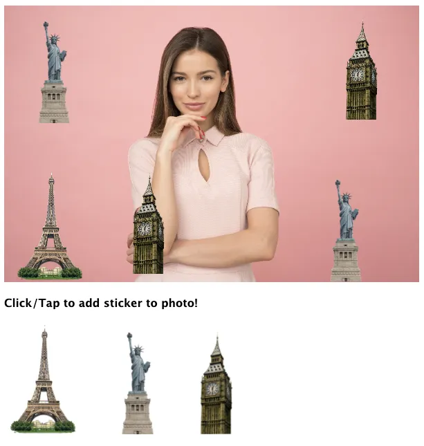
Checkpoint: Draggable stickers that work well on mobile and desktop! 🎉
⁉️ WAIT, but I want to be able to delete the stickers!?
✅ Okay, let’s continue with the tutorial. Things get a little more complicated here!
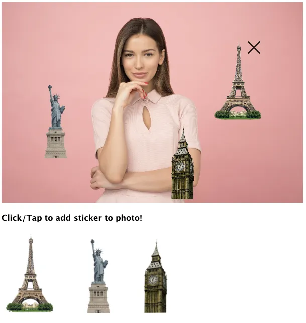
Deleting the stickers
In order to delete stickers from the canvas we add a cross icon to the top right corner of each sticker.
- On mobile the cross appears on long tap of the sticker
- On desktop the cross appears when you hover over the sticker
Let’s add another KonvaImage to our individual sticker and wrap it in a Group so the sticker and cross icon are grouped.
export const IndividualSticker = ({ image, onDelete, onDragEnd }) => {
  const [stickerImage] = useImage(image.src);
  const [deleteImage] = useImage("cancel.svg");

  const stickerWidth = image.width;
  const stickerHeight = stickerImage
    ? (image.width * stickerImage.height) / stickerImage.width
    : 0;
  return (
    <Group
      draggable
      x={image.x}
      y={image.y}
      onDragEnd={(event) => {
        onDragEnd(event);
      }}
    >
      <KonvaImage
        width={image.width}
        height={stickerHeight}
        image={stickerImage}
      />
      <KonvaImage
        onTouchStart={onDelete}
        onClick={onDelete}
        image={deleteImage}
        width={25}
        height={25}
        offsetX={-stickerWidth / 2 - 20}
      />
    </Group>
  );
};
- Render a cross icon using the
useImagehook - Add the
draggable,xandyproperties to theGroupso that they are common to both images - Use the offset properties on the delete button to position the cross where you like
- Add the
onClickproperty and pass theonDeletefunction. Also add theonTouchStartproperty so that this works on mobile too! - Pass an
onDeletefunction detailed in App.js- Use a splice to remove the image from the local state when the delete button is tapped/clicked
onDelete={() => {
  const newImages = [...images];
  images.splice(i, 1);
  setImages(newImages);
}}
We need to ensure that the x and y position of each sticker in the local state is updated appropriately - we make use of the Group’s onDragEnd property. We pass in the following function from the App.js file. This updates the x and y position of the sticker at the end of the drag movement.
onDragEnd={(event) => {
    image.x = event.target.x();
    image.y = event.target.y();
  }}
Checkpoint: The cross shows when we add a sticker to the photo. When we tap/click the icon, it deletes the sticker as expected

Now, we only want to show the cross when we hover on desktop or long press on mobile - let’s continue!
We use the react-use useLongPress and useHoverDirty to show the cross on long tap (mobile) or on hover (desktop).
Let’s amend IndividualSticker.tsx to look like the following…
const imageRef = useRef(null);
const isHovered = useHoverDirty(imageRef);

const [showDeleteButton, setShowDeleteButton] = useState(false);
const [isDragging, setIsDragging] = useState(false);

const onLongPress = () => {
    setShowDeleteButton(true);
  };
const longPressEvent = useLongPress(onLongPress, { delay: 200 });

useEffect(() => {
    if (isHovered) {
      setShowDeleteButton(true);
    } else {
      setTimeout(() => {
        setShowDeleteButton(false);
      }, 2000);
    }
  }, [isHovered]);

return (
    <Group
      draggable
      x={image.x}
      y={image.y}
      onDragStart={() => setIsDragging(true)}
      onDragEnd={(event) => {
        setIsDragging(false);
        onDragEnd(event);
      }}
    >
      <KonvaImage
        ref={imageRef}
        width={image.width}
        height={stickerHeight}
        image={stickerImage}
        {...longPressEvent}
      />
      {showDeleteButton && !isDragging && (
        <KonvaImage
          onTouchStart={onDelete}
          onClick={onDelete}
          image={deleteImage}
          width={25}
          height={25}
          offsetX={-stickerWidth / 2 - 20}
        />
      )}
    </Group>
  );
- We add a
refto the image that will be hovered.useHoverDirtyis true when the image is hovered - We store the
isDraggingandshowDeleteButtonbooleans in the local state using theuseStatehook - When we long tap and image we set the
showDeleteButtonstate to true after a delay of 200ms - The
useEffectensures that the delete button disappears after the 2s of the image being hovered if it is not deleted. - We only display the delete button if the the
showDeletebutton state is true andisDraggingis false. This ensures that we don’t show the delete button when we’re dragging. This is a little hacky but it considers all the cases for mobile and desktop use!
We now need to ensure that the cross disappears if a user taps an area not associated with the sticker.
In App.js
const addStickerToPanel = ({ src, width, x, y }) => {
    setImages((currentImages) => [
      ...currentImages,
      {
        width,
        x,
        y,
        src,
        resetButtonRef: createRef()
      }
    ]);
  };

const resetAllButtons = useCallback(() => {
    images.forEach((image) => {
      if (image.resetButtonRef.current) {
        image.resetButtonRef.current();
      }
    });
  }, [images]);

  const handleCanvasClick = useCallback(
    (event) => {
      if (event.target.attrs.id === "backgroundImage") {
        resetAllButtons();
      }
    },
    [resetAllButtons]
  );
- We create a new
refon each button using React’screateRef - We add the
handleCanvasClickwhich resets all the refs on the buttons so that we don’t display the cross!
In the Stage add the onClick and onTap to handle this.
<Stage
        width={600}
        height={400}
        onClick={handleCanvasClick}
        onTap={handleCanvasClick}
      >
The Result
Using react-konva to build a great photobooth experience within a react app was really fun and I’ll look forward to using this framework again! Check out more react-konva examples here and don’t forget to checkout my codesandbox!
Sources + links: