How I Used Power Query to Monitor my Logs on MacOS
François Lorne10 min read

While developing an app I repeated a few times a painful process of creating hand charts describing the behaviour of my script. I rolled up my sleeves to create a workflow that could generate a pretty interface in a single click. I knew that in the realm of data analysis and visualisation, ETL tools (softwares that Extract, Transform, and Load data) held significant weight. As I had some experience with Microsoft Power BI from a few years back, I knew that it answered my issue perfectly: quick data manipulations, easy concatenation of files, and ergonomic reports. I hit a bone when discovering that the developers of Power BI had never adapted their software to run on macOS. Thankfully, the ETL tool is not exactly Power BI but a nested tool called Power Query, which also exists on Microsoft Excel! Here is how to exploit this feature.
Step into the realm of IT project optimisation, where monitoring logs is critical for decision-making and performance enhancement. Discover the toolkit offered by Microsoft Office, including Excel, Power BI and Power Query, and how to extract insights from raw data using these softwares. My use-case will be to pull data from log files, isolate the most recurring bugs and monitor the performance of the different steps of my script, but it can be applied to any data analysis and visualisation project, such as sales monitoring or customer behaviour analysis.
The Power BI proposition
Power Query justifies the word “power” in Power BI. Its prowess lies in its ability to seamlessly extract data from multiple sources, clean it, combine it, transform it, and finally inject it with finesse into reporting tools. The Power BI interface catches the output, sums up the formatted tables into simple values and splashes the result into ergonomic online dashboards accessible by everyone. This stack could initially be categorised as LowCode due to its user-friendly interface, but can evolve into a powerhouse when delving into DAX and M languages.
The duo of Power BI and Power Query beckoned me for its meticulousness and elegance. It promised a realm of possibilities for automatic perfectly refined reports. My 3-values bar charts could glow up into perfectly summarised KPI. Additionally, the simplicity of constructing visualisations within the platform would be liberating, transforming complex datasets into insightful graphics with minimal effort.
Navigating MacOS’s Limitations
Despite the undeniable appeal of Power BI, I could not find any website to download the software on my MacBook. Despite developers’ and product owners’ pleas, Microsoft refused to adapt to the macOS kernel because it would represent a year’s worth of the company’s development funds. This choice left the users grappling for alternatives to still use Power BI. My time, mental space and computer memory were too precious for dual boots and other workarounds, so I had to let Power BI go. If this is not your case, you can install Windows on a virtual machine and launch Power BI on it.
Here is my tutorial to help you bypass the limitations of macOS and still use Power Query to display your data.
Unleashing Power Query’s Potential
Step 1: Encountering my old friend on MacOS
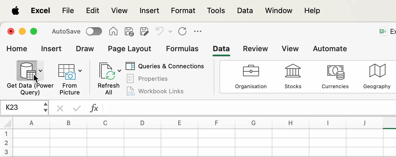
To find Power Query on Microsoft Excel, open the data tab, and click on the button mentioning “Power Query”. By clicking on the data source that interests you and following the instructions of the popup, you will soon have it: an ETL piping your data straight from your file into Excel. This feature was added over a year ago (see the announcement) and freed thousands of macOS users. In their wake, I started a new clean Excel file and booted Power Query with my first log file.
 To pick the most suitable data extraction for your use case, you can read the official documentation which describes each one of the options available. Just as I was, I hope you will be outraged by the number of features missing between the Windows version and the macOS one. We will come back to this later.
Step 2: Preparing the data
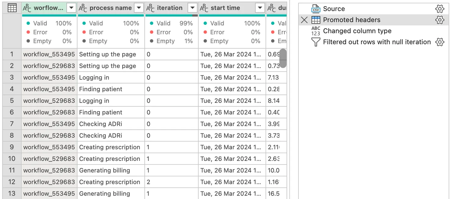
Before embarking on a journey to extract insights it is necessary to verify that your data is readable. This might not be necessary for everyone, but in my case, I had to write a bit of code to clean my logs. I already had a decorator that I added to the functions to be timed, so I just had to redirect my logs to a CSV file instead of my terminal. I implemented a CsvLogger object that could append rows to a file using the package @fast-csv/format. See the code below on how I used it in my decorator. As the most expert of developers might have appreciated, to print the date in a file, it appeared necessary to cast it to a UTC format. The misinterpretation of dates is an ever-present stumbling block and I wanted to tackle the issue as fast as possible. We will never stress enough the importance of meticulous date formatting to ensure an accurate manipulation.
const csvFile = new CsvLogger();
const startTime = new Date();

const result = await functionToBeTimed.apply(this, args);

const endTime = new Date();
const duration = endTime.getTime() - startTime.getTime();

await csvFile.append([
  {
    "process name": processName,
    "iteration": iteration,
    "start time": startTime.toUTCString(),
    "duration": duration,
    "output": result,
  },
]);
Step 3: Transforming and combining tables
After having imported your data into Power Query, you should first clean it until you have a satisfactory table. The most basic operations can be done by clicking on the column headers: renaming, setting the correct type, and filtering unwanted values. To go further, you can investigate the possibilities offered by the transform tab (for a step-by-step guide, see this tutorial).
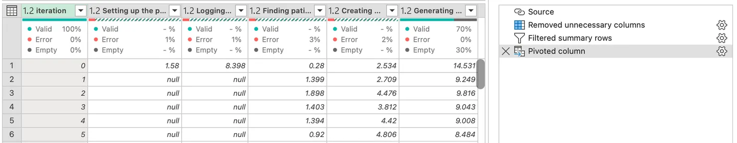
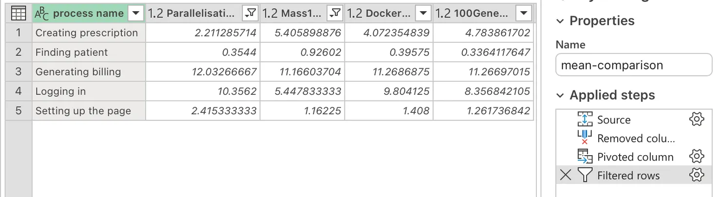
The interface was as intuitive as I remembered and I hope you will feel the same too. I want to attract your attention to one of PowerQuery’s mightiest features: the pivot table. It is a powerful tool that summarizes data in a table by grouping and aggregating values. In my case, you can see that each step of my process has been separated into a different column and has a value for each of the iterations.
To exit Power Query click on the “Close & Load” button, and you will have a table with all of the data you prepared. Creating graphs is then only a matter of time and Excel knowledge.
Step 4: Deflating Aunt Marge
When working for a while on a project, the number of files started to add up and I realised that my stakeholder was only interested in a few key values. To group the different tables into one, I used the append feature of PowerQuery.
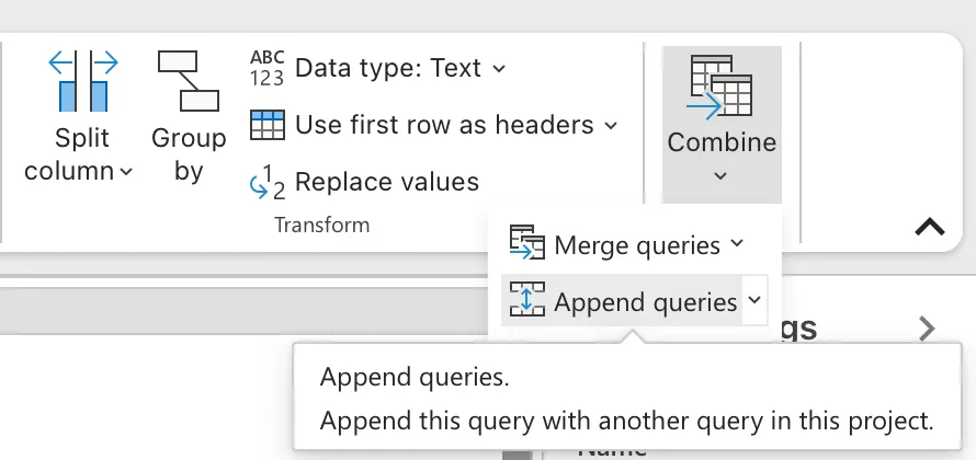
It concatenates the tables one after the other, which is perfect to compare different runs of my script, or different months in the case of sales.
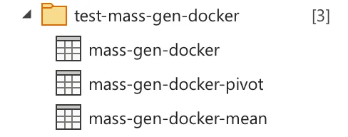
Yet, as the dataset expands and the manipulations lengthen, tables can proliferate. Each new test or each new month generates new tables. Each one of them in Power Query creates a new spreadsheet in Excel. Nothing can stop the phenomenon. In my case, I had three tables per test: one for cleaning, one for aggregating the mean values, and one for the pivot table. The file was growing like a balloon.
This inflation made me fear an Aunt Marge explosion, forcing a strategic reassessment to curtail redundancy. The first action was to group the operations of my three tables into one to keep only one page per test. To do so, you can replicate the steps one by one from the final tables to the source one. For example, instead of referring to the previous table and then pivoting the data, you would pivot the data directly in the source table.
I could have stopped there but no. Even if the balloon grew more slowly, it still grew, to create the perfect file I had to push the optimisation even further.
Step 5: Optimising the code
The master solution is abstract the importation step step to prevent the temporary tables from actually appearing at all in the navigation panel.
Importing multiple files from a folder is quite a common data source on Power Query for Windows, but this feature is not available on macOS. Even if Microsoft banished us MacOs users from using all of their data sources as mentioned earlier, there is a workaround for us (see other available hacks here). The first tool is Excel’s macro. The goal is to grant read access to the folder where the files are stored.
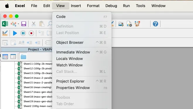
- Open the VBA window of Excel by pressing the left arrow key, the option key and the F11 key at the same time and access the “immediate window”.
- Write the following code in the newly opened terminal to trigger a modal:
print Dir("/path/to/data/folder"). - Follow the instructions and navigate to your data files to grant access to Excel to the folder you want.
- Update Power Query, by quitting the app and reopening it. The editor will not see the change in the access rights if the app is not restarted completely.
- Launch the Power Query editor: you’re all set!
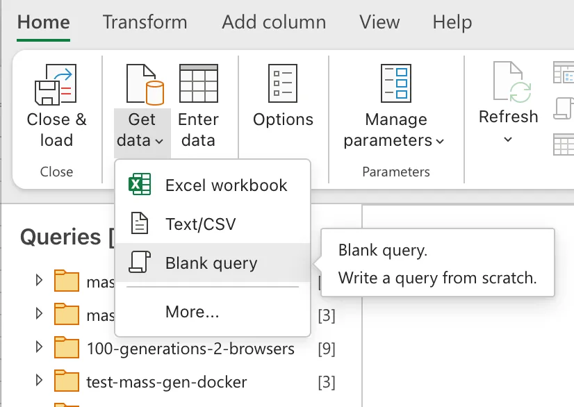
We can now import all of the files in the folder using a second tool: the M language. It is the underlying code that makes all of the data manipulations. There is no fancy button to trigger the folder extraction feature, but we can still have access to it by excavating the functions implemented originally for Microsoft. To dig into this realm, create a blank query instead of using the usual “Get Data” button.
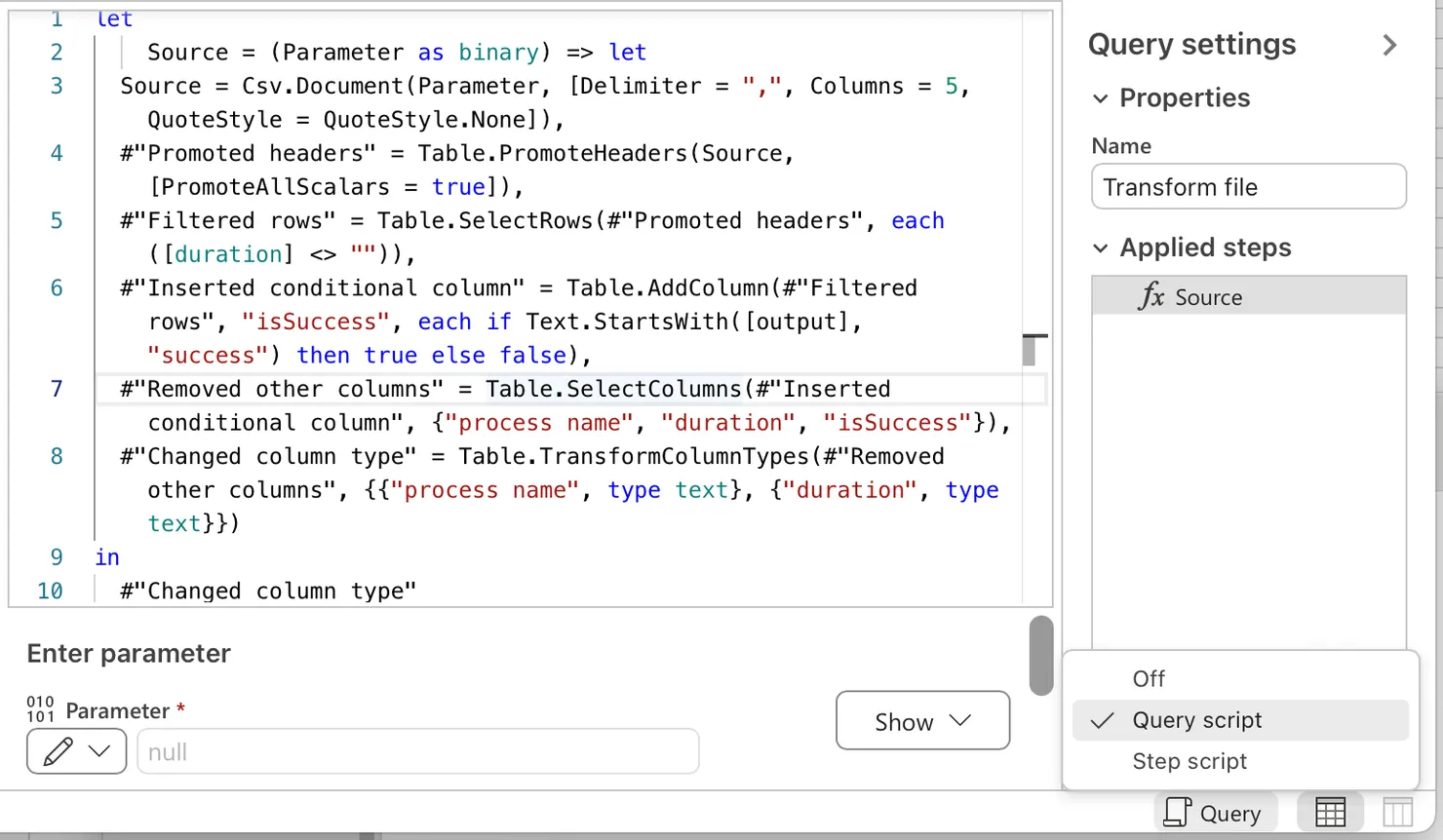
In the modal that opens, give the value Folder.Files("/path/to/data/folder") to the Source variable. This will create a table with all of the files contained in the targetted folder. Once you are done with this popup, you will see the list of all of the files in your folder. By clicking on the header of the first column, you will trigger two things at once: the creation of a function that will format all of the tables and the concatenation of these formatted tables into one. There are another couple of objects that should have appeared. They enable you to see and adapt how the function handles a table. As you might have guessed, this generic handling is exactly what I have been doing by hand since the beginning. As soon as the automation is set up, you just need to transfer the steps used on all of your tables into the newly created function. To do that, open the query script by clicking on the button in the bottom right corner of the screen.
By accessing it, you can copy the steps from your old tables into the new function. Once this is done, you can go back to the concatenated table and see the result of your work. The file is now a lot more manageable and the balloon has deflated!
Reflections on Lost Possibilities: The Power Query vs. Power BI Dilemma
Reflecting on my journey with Power Query and Excel, I can’t help but ponder what I lost compared to having used Power BI. My biggest regrets were the concealed tables to unleash my data frenzy, the relational graphs to enhance the dev experience of creating widgets, and of course the interactive online dashboards adorned with measures and filters. My journey for log monitoring has illuminated the potential of ETL to drive operational excellence. While my quest initially led me to lament the absence of Power BI on MacOS, it ultimately opened new avenues of exploration within the unfamiliar combination of Power BI and Microsoft Excel.
Further Documentation
- To discover other hidden data extraction methods, go see the video of Mr Excel on YouTube
- To dig into Power Query, go see the official documentation on Microsoft’s website
- To have a closer description of the operations possible on a table, I suggest this tutorial on Simplilearn

François Lorne
Software Engineer @Theodo