The State of Building Native Mobile and Web Apps from a Single Codebase with React Native in 2023
Mo Khazali10 min read

This article is a write-up based on a talk I’ve given called “Building Universal Apps in React Native”. It was first delivered at iJS Conference London in April 2023. This article is not meant to go into detail about all of the components to build a universal app, rather it aims to break down the problem and paint a holistic image of what components and considerations are important. In the future, I will be writing more in-depth
Introduction
Developing native mobile applications for iOS and Android platforms can be time-consuming and expensive due to the need for specialised developers and separate technologies for each platform. However, React Native has provided a solution that enables web developers to build mobile apps using a single codebase for both platforms. This article will explore React Native, React Native for Web, and the benefits of creating a universal app that runs on iOS, Android, and the web.
React Native: Bridging the Gap between Web and Mobile
React Native, released in 2015 by Facebook, is built on top of React and uses the same component-based architecture and virtual DOM approach. It allows developers to create apps for both iOS and Android platforms using a single codebase, significantly reducing development time and cost.
React Native exposes a common API to use, which maps to native UI components in the target platform (mainly Android and iOS). This means that in a React Native app, you’ll have actual native components and the target code will be Swift or Kotlin.
One common API with different implementations under the hood.
We’ll keep revisiting this idea throughout this article…
React Native for Web: Bringing React Native to the Web
React Native for Web was created in 2015 by Nicolas Gallagher. It allows developers to create web apps with the same look and feel as native mobile apps using the same codebase and components. This approach has been adopted by big companies like Twitter, Flipkart, and the MLS, as well as startups like Guild.
The challenge with React Native for Web is that it’s a tool dealing with the primitives - essentially mapping React Native elements to the DOM. For example, mapping <View> to <div> and <Text> to <p>.
The Pitch: “Write Once, Run Anywhere”
React Native and React Native for Web enable cross-functional teams to write either web or mobile applications. Imagine being able to share the codebase fully across web and mobile, creating one app managed by one team that deploys to native iOS and Android apps, along with a fully functioning web app or even a Progressive Web App (PWA) if you’re feeling spicy. Creating a universal app with React Native and React Native for Web aims to fulfill the dream of “Write Once, Run Anywhere”. This means that your codebase can be shared across web and mobile platforms, making it easier to manage and maintain the application. Not only does this streamline the development process, but it also allows you to create a consistent user experience across all platforms. Here’s a deeper look into the benefits:
Feature Parity across Platforms
With a shared codebase, you can ensure that features and updates are consistent across web and mobile platforms. This eliminates the need for platform-specific development efforts and ensures that your users receive the same experience, regardless of the device they are using.
Speed Increase & Cost Decrease
Developing separate applications for web, iOS, and Android can be time-consuming and costly. By using a shared codebase for all platforms, you can significantly reduce the development time and cost. This enables you to allocate resources more efficiently and bring your product to market faster.
Smaller Team Footprint & Lower Organisational Bureaucracy
Having a single codebase allows you to maintain a smaller development team with expertise in React Native and React Native for Web. This not only reduces the complexity of managing multiple teams but also simplifies communication and decision-making processes within the organisation.
Components to Building a Universal App
To create a universal app, you’ll need to consider the following aspects and understand how to share code and implement platform-specific functionalities:
Sharing business logic
Your application should have the same business logic across all platforms. For example, the maximum number of entries a user can input for a form field should be consistent.
// shared/validateForm.js
export const validateForm = (formData) => {
  // Define the maximum number of entries allowed
  const maxEntries = 5;

  if (formData.length > maxEntries) {
    return {
      isValid: false,
      errorMessage: "Maximum number of entries exceeded",
    };
  }

  // Add more validation logic as needed

  return { isValid: true, errorMessage: "" };
};
Calling APIs
In most cases, across web and mobile, you’ll be calling the same backends through a unified set of APIs. The caching solution, data transformation, and other points can be kept the same across the board.

As a result, you can abstract out all of the API calls, logic, and transformation into an API Gateway layer that can be shared across the different platforms. In this (rather simple) example, we’ll use the TanStack Query library to manage data fetching and caching and export endpoints to fetch data:
// shared/api.js
import { createClient } from "react-query";

const apiClient = createClient({
  defaultOptions: {
    queries: {
      refetchOnWindowFocus: false,
      staleTime: 60 * 1000,
    },
  },
});

export const fetchData = async (endpoint) => {
  try {
    const response = await fetch(`https://api.example.com/${endpoint}`);
    const data = await response.json();
    return data;
  } catch (error) {
    // Handle error
    console.error("Error fetching data:", error);
    throw error;
  }
};

export default apiClient;
App Config

Config files, types, translations, and constants can be reused across platforms. This is not only faster, but also improves consistency.
Configuration files often contain key parameters that influence your app’s behavior. Sharing these files across platforms ensures that all versions of your app behave consistently. If different platforms may require slight alterations or extensions to these configurations, you can extend the shared configuration objects to include platform-specific parameters without needing to clutter the shared version.
Sharing app state
Modeling your application state is largely the same across platforms. For example, user authentication state and local app customizations for language preferences or display options should be consistent. In this example, we’ll use XState to manage the application state.
// shared/stateMachine.js
import { Machine } from "xstate";

const appStateMachine = Machine({
  id: "app",
  initial: "unauthenticated",
  states: {
    unauthenticated: {
      on: {
        LOGIN: "authenticated",
      },
    },
    authenticated: {
      on: {
        LOGOUT: "unauthenticated",
      },
    },
  },
});

export default appStateMachine;
Sharing Navigation
Navigating between screens is an essential part of any app, whether it’s a web or mobile application. The challenge lies in the differences between web and mobile navigation. Web navigation typically uses a flat structure with URLs, while mobile navigation is often more complex and hierarchical, involving stacks, tabs, drawers, and modals.
React Navigation for Mobile
React Navigation is the most popular library for handling navigation in React Native. It uses a declarative approach, allowing you to define your navigation structure with JSX. Here’s an example of a basic stack with multiple screens:
import { createStackNavigator } from "@react-navigation/stack";
import HomeScreen from "./screens/HomeScreen";
import ProfileScreen from "./screens/ProfileScreen";

const Stack = createStackNavigator();

function App() {
  return (
    <NavigationContainer>
      <Stack.Navigator initialRouteName="Home">
        <Stack.Screen name="Home" component={HomeScreen} />
        <Stack.Screen name="Profile" component={ProfileScreen} />
      </Stack.Navigator>
    </NavigationContainer>
  );
}
React Navigation also allows you to define a linking object that maps your screens to URLs:
const linking = {
  prefixes: ["https://myapp.com", "myapp://"],
  config: {
    screens: {
      Home: "home",
      Profile: "profile",
    },
  },
};

// Add linking to the NavigationContainer
<NavigationContainer linking={linking}>
  {/* Your Stack.Navigator */}
</NavigationContainer>;
However, this method can result in duplication and extra work to maintain consistency between web and mobile navigation.
Unified Navigation with Expo Router
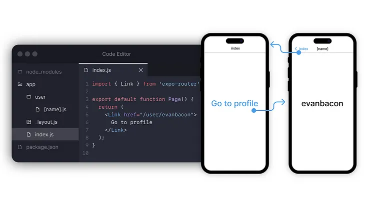
Expo Router aims to bridge the gap between mobile and web navigation by unifying the navigation structure in the file system. While this works for some use-cases, it may not provide enough robust functionality for web applications that require features like server-side rendering (SSR) for better SEO.
Solito for SSR

Solito allows you to unify routes and navigation between your Next.js and React Native applications. It recognizes that your screens may have different navigation structures (mobiles using stacks and web adopting a flat structure) but keeps the actions that navigate users to different navigation states the same.
By defining URLs as your single source of truth for both web and mobile, Solito can determine how to navigate to the correct screen for the given URL based on the platform being used.
One common API with different implementations under the hood.
Sharing Rendering and UI Elements
Perhaps the biggest point of divergency is to do with the actual UI elements and rendering. React Native for Web addresses the difference in render environments between web and mobile platforms, but it doesn’t solve the distinct UI/UX challenges present in the UI layer. To better understand these challenges, let’s break them down into two main categories: components and layouts.
Components
Creating universal components for both web and mobile platforms can be tricky. Component behavior often varies across web and mobile environments. For instance, web interfaces require hover states to indicate interactivity, while mobile platforms use system-specific icon designs that users are familiar with.
The classic issue that arose with web apps running on mobile devices is the double hover problem. This occurs when hovering is implemented in a non-mobile-friendly way, requiring users to press twice for a single interaction. Removing hover states altogether can make the web interface feel unnatural.
The solution to this challenge is to style and program components targeting both platforms, adding extra functionality to ensure each platform feels more ‘native.’ By customizing components for web and mobile platforms, you can create a seamless user experience across devices.
To further streamline the development process and maintain consistency across platforms, consider the following strategies:
- Share styling constants, such as colors, spacing, and fonts, to maintain a cohesive design across web and mobile platforms.
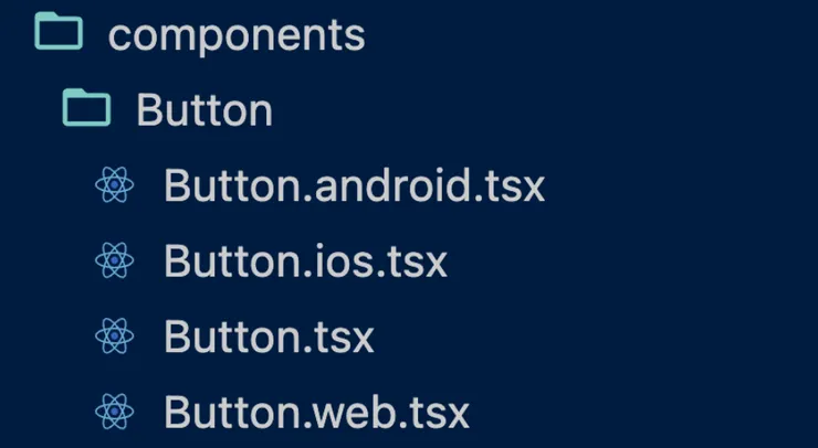
- Create a base-level component, like
Button.tsx, and extend it for each platform with platform-specific files:Button.android.tsx,Button.ios.tsx, andButton.web.tsx. This approach allows you to customize the component’s behavior and appearance for each platform while still sharing common functionality and styles.
One common API with different implementations under the hood.
Layouts
Layouts are another aspect of UI that differs fundamentally between web and mobile platforms. This is probably the toughest challenge to get right.
Generally, if your app’s interface includes primary and secondary sections, you might create a double-column layout for the web (desktop) version. However, on mobile devices, you would likely use drawers or separate tabs to accommodate the smaller screen size.
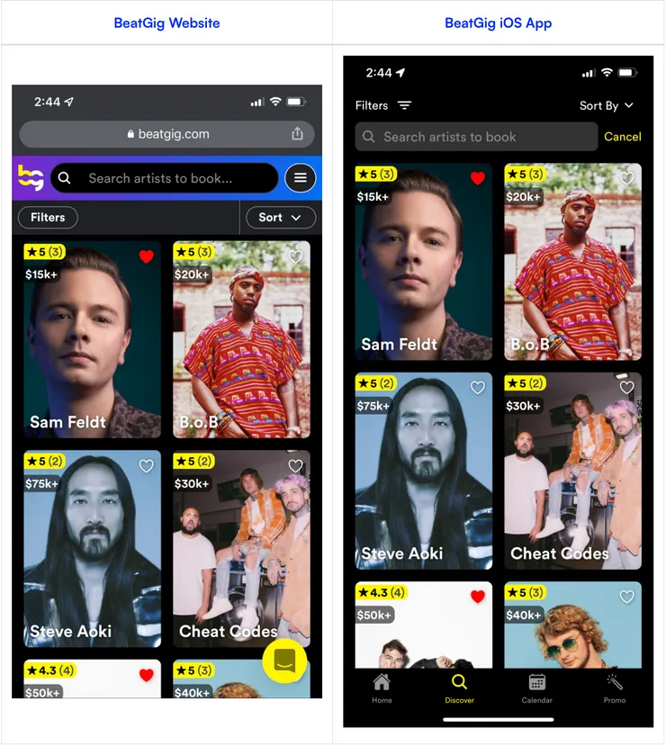
Fernando Rojo, the creator of Solito, has a good approach for this. If you look at Beatgig (his startup), the components are shared across the board and are universal, but layouts and how the screens are laid out are platform specific.
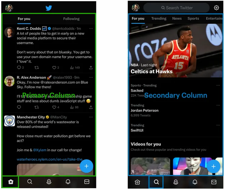
Let’s look at another example - consider Twitter’s layout: On desktop, we have a multicolumned layout. The main feed is the primary column, and the secondary column lets you search and see what’s trending.
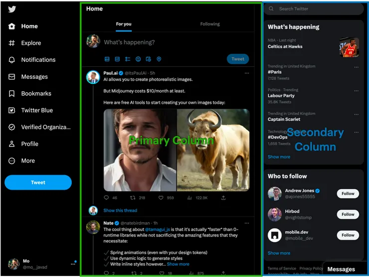
Looking at the mobile app, the feed is located in the home tab, while the search and trends are put in a totally separate column.
While the components are shared, and look very similar, the layouting is fundementally different depending on the platform. This approach maximizes screen real estate on web and while providing a user-friendly native experience for mobile users.
Wrap-up
This article (and the talk it’s based on) aims to break down the problem of building universal apps into smaller chunks, and focus on what can and can’t be shared. The key takeaway for me is to focus on sharing business logic, app state, API calling, and try to share what makes sense in terms of navigation and UI elements. Taking a pragmatic middle ground means you can still have tailored experiences across the board, without needing 3 separate teams.
Feel free to reach out
Feel free to reach out to me on Twitter @mo__javad. 🙂