From Responsive on Mobile to Mobile-First
Mo Khazali5 min read
It’s no secret that web development has changed massively with the rise of smartphones. Back in the day, websites were typically targeting desktop resolutions, and many websites required you to use a computer to have a pleasant experience.
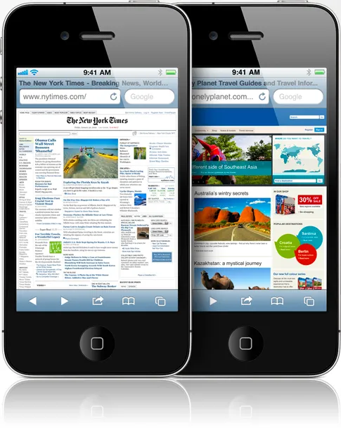
Here’s a little flashback: when Apple was launching promotional content for the iPhone 4, two of the top websites it chose to show were NYT and LonelyPlanet, which were both desktop only and non-responsive. This was the unfortunate state of browsing on a phone in the late 2000s/early 2010s.
Some places decided to tackle this with the m. or mobile. version of their sites. However, given these were watered down versions of the desktop counterparts. Take the same NYT example: users could go to m.nyt.com but they’d receive a far blander, less feature heavy version of the NYT website.

As mobile usage grew, responsive web design came into the spotlight. Soon, we had grid and flex based layouts, media queries, and all the components needed to style full websites across web and mobile.
Initially, the approach to responsiveness was desktop-first. This meant that websites would be designed with desktop users as the primary target, and afterwards they’d be adjusted and converted to a mobile form. This approach meant that applications were still designed primarily around desktop functionalities and lost some of the core UX that users come to expect when using mobile apps.
Now, the NYT website is fully responsive - not some stripped out ‘lite’ version. It’s got all the same features as the desktop application, and it works as you’d expect a mobile app to behave: swiping left and right in a gallery changes the image, and there are full width images that make content engaging on mobile.

It seems like the tide has shifted, and it’s primarily driven by the growth in mobile use over the past decade.
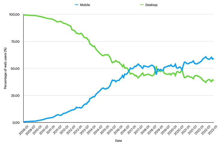
Since the late 2000s, the percentage of mobile users on the web has been steadily increasing. In 2016, mobile and desktop users equalled one for the first time. Desktop and mobile overtook one another for the next few years, however, since 2020 mobile usage has pulled ahead and is slowly growing further. Currently, roughly 60% of web users are mobile.
Source: Business of Apps
This appetite for mobile is only increasing with newer generations. According to an IBM study, 75% of Gen Zs use their smartphone as their preferred device.
Given the growing market share of mobile usage over desktop, it is important to build mobile-first, and then adapt your product to desktop users. This mindset shift means that you design your application with a mobile-centric experience and benefit from the strengths of mobile apps.
Of course, there are exceptions - if you’re building the next work tool (think Figma, GSuite), these will still mainly used on desktops because they’re mainly used in professional settings. However, this should be the exception rather than the norm. Most applications will be used more on mobile than desktop.
Companies have already started taking this approach, and you can start to spot “mobile-first” designs on desktop webapps.
Let’s look at a few examples:
1. Youtube
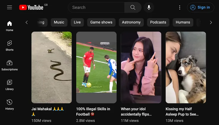
Short form content has taken over the internet, and Youtube’s jumped on the bandwagon. Firstly, the content is all portrait, which is common for mobile social medias like Tiktok, so this entire feature’s been designed around mobile users. If you look at the UI of the “Shorts” player, it also replicates mobile in many ways. It’s a basic redo of the same UI - down to the swiping manual button to “swipe up and down”.

2. Huffington Post

News outlets have been tailoring more towards mobile usage. It’s becoming more common to read the news in passing, riding on the tube, or in between other activities. This means that a lot of elements on the desktop side of things will start to look more tailored to mobile.
In the case of the Huffington Post, you can see the first article is spanning the full page’s width, rather than the classic multi-columned layout that has been the norm on the web.
As a little bonus, you can spot the hamburger menu on the top left corner. Its resurgence is largely attributed to the rise of mobile UIs needing it for conserving space.
3. Nike
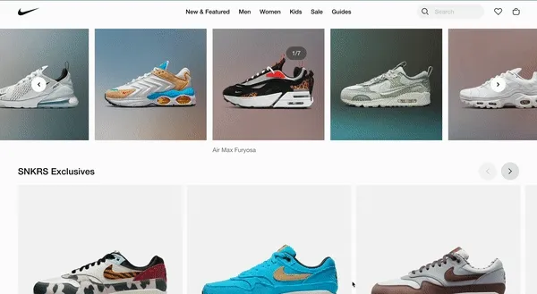
Last example, Nike’s homepage has a product carousel that is swipe-able left and right to browse. While there are still buttons to browse (presumably for accessibility), the carousel is designed with swipes as the primary UX interaction. That’s not scrolling, but pressing down on your mouse/trackpad and moving the carousel! Definitely a mobile first design!
Final Thoughts
I want to finish here with how web technologies are adapting to replicate patterns in mobile. (This isn’t me advocating and saying you should adopt these newest APIs. It’s merely an observation of the technologies converging)
The latest version of Chrome (v111) as of writing this article has introduced the View Transitions API for SPAs.
If you’re a mobile element, this is nothing new - it’s a stack navigator + shared element transition. This is just the latest advancement and the trend will continue - mobile and desktop UIs are converging and with mobile’s market share pulling ahead, it’s natural that companies will prioritise their mobile experience.
Feel free to reach out
Feel free to reach out to me on Twitter @mo__javad. 🙂