Building Terravision(2021) using Deck.gl and Carto
Eddie MG12 min read
Adding a detailed and interactive map to a web app can be a time consuming process. Pairing deck.gl and carto with react can make it pain free. Using Carto to manage your data and Deck.gl to render it can make for a great developer and user experience. Resulting in a web app rich with detailed and engaging visualisations.
TLDR: skip to case study section if you’re too cool for context…
Intro
At the beginning of the Netflix show The Billion Dollar code, you’re introduced to two German developers, Juri Muller and Carsten Schlute. As the series progresses we learn more about Terravision, an application that the two developers and their team (ART+COM) develop that closely resembles the modern day map software we are all familiar with, Google Earth. The series takes place in the 90s and hence the algorithms and mapping software that we use today has progressed significantly from the first versions of Terravision and Google Earth.
Nowadays, as a web developer, the inclusion of a map in your application can surpass the simple use cases provided by the google maps API. Whether it be needing to display a dynamic view of nearby taxis for your journey home or a heat map showing what people in your city are up to; maps in modern day applications are rich with information and data. Two tools that can be used to build rich map visualisations in web applications are Carto and Deck.gl.
Simply put, Carto is a data warehouse that specialises in data for geospatial analysis with some magic under the hood.
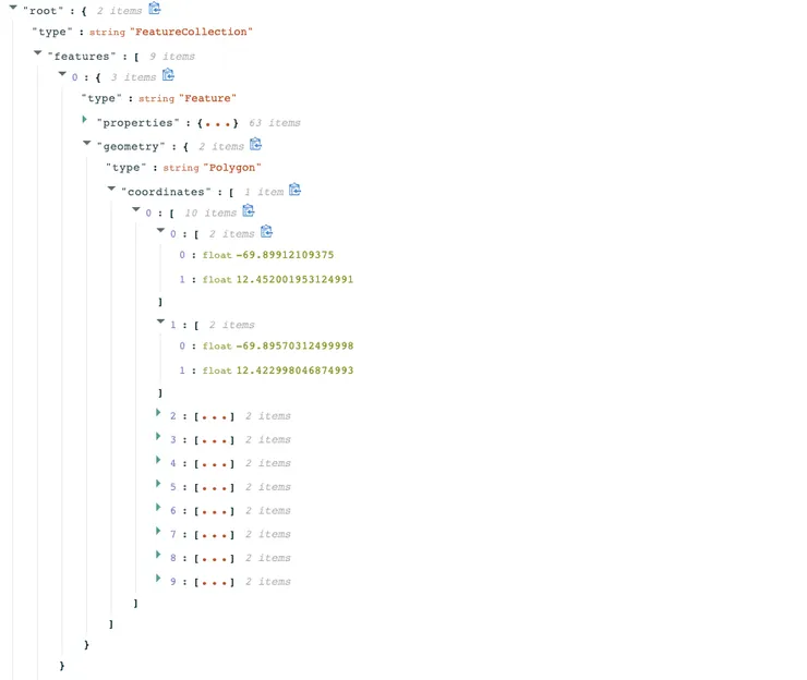
If you’re building an application that requires demographic data detailing the populations of cities in Europe just search through the catalogue, get the URL of the data set and import it using their API. Carto is built with developers in mind and hence they have a great API that pairs really well with the second tool I’ll be talking about, deck gl. If you make a call to their SQL api to obtain the data you’ll see a result containing demographic data mapped to a set of long lat coordinates. This format (GEOJSON) is an industry standard that can be interpreted by most mapping software but can be tedious and cumbersome to generate manually so it’s great to have an easily accessible source.
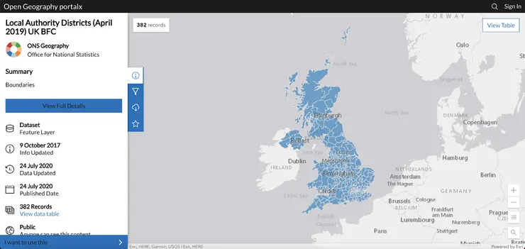
Note: For readers in the UK another great source of geospatial data is the ONS.
So now we have our maps and the data to enrich them. We need a way to combine them and display the result in our web app. Deck.gl is a software specialising in mapping and geospatial visualisation. It offers a react library designed to create high-performance web-GL based visualisations for large datasets. Hence it’s one of the easiest ways to integrate geospatial visualisations into your applications. The library is really intuitive and highly optimised out of the box. It also contains a bunch of different features that will fit a large number of use cases required by your application.
Case Study
Let’s talk through a real world example. Say you’re an international news company and you want to revamp the user experience of your website. You cover news stories all across the globe but you’ve gotten feedback from users saying finding new, interesting stories can be difficult and your team has proposed a new map interface to display all the current popular stories. As well as displaying the stories on the map you think it would be nice to supplement the articles with contextual information about the countries you’re covering (GDP, HDI, Life Expectancy, etc).
Slight caveat. Unfortunately, Carto is not a free piece of software so for the example I will be using a dataset that I’ve downloaded from Kaggle. Hopefully talking through the full process that I have to follow to integrate a generic dataset into our application and how it differs from using Carto will allow me to highlight the convenience of using Carto in your workflow.
The Data
To begin with you’ll need to source the data for the contextual information. As noted above, a quick search on Kaggle you can find a list of demographic indicators for all countries in the world. Granted this is outdated but this is where something like Carto comes in handy as it provides up to date data in the required format.
Using Deck.gl with next.js and react
Now we have our data, the next task is to set up your project. Deck.gl works with react out of the box so you can use the next project starter to generate a react project and get going from there. Firstly, you’ll need to create a DeckGL component for your page. This is where all of your geospatial visualisations will sit.
<DeckGL initialViewState={INITIAL_VIEW_STATE} controller={true}>
  <StaticMap mapboxApiAccessToken={MAPBOX_KEY} />
</DeckGL>
The above code snippet would display a simple map on the page where you render the DeckGL component. You will see there’s a child component StaticMap. This child handles the map element of our page. Deck.gl can easily integrate with mapbox so all you need to do is create an account and use the public token to add a map to your Deck.gl component.
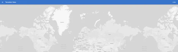
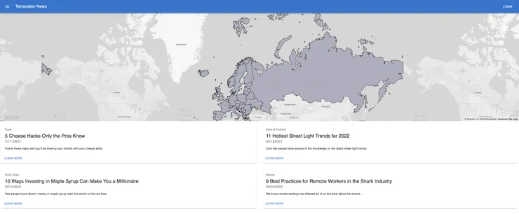
As you can see the map currently takes the whole of our page but we need to limit it to the hero section of the screen so we can see the articles as well. Adding the following prop to our Deck.gl component allows us to add some styling:
views={[new MapView({ width: '100%', height: '44%' })]}
The resulting page:
So now we have our map displayed on the homepage of our website, the next task is to take the geojson data we downloaded from Kaggle and add it to the map. For this I’ve opted to store the layers in the state which is populated when the page mounts. Using getStaticProps, I read the json file from disk and pass it as a prop to the homepage. This prop is then used to dispatch a redux action that takes the json data as an argument and returns the layers.
Note: The format of the geojson data is not fully inline with what deck.gl expects (one reason why using Carto would be nice here) and hence I have to do some transformation on data load. An alternative solution here would be to process the data once yourself and then have this loaded into the app when the page mounts.
I handle the creation of the layers inside a redux saga. For the geojson data I create a new instance of the PolygonLayer class.
// Create basic polygon layer from geojson data
 const europeLayer = new PolygonLayer({
   id: 'real-poly-layer',
   data: action.payload.geoJson,
   getPolygon: d => (d as { type: string; geometry: { type: string; coordinates: Position[][] } }).geometry.coordinates,
   getFillColor: [160, 160, 180, 200],
   getLineColor: [0, 0, 0],
   getLineWidth: 1,
   lineWidthMinPixels: 1,
   pickable: true,
   stroked: true,
   filled: true,
   wireframe: true,
 })
So we now have an instance of a polygon layer generated from the data read from the disk. The last thing to do now is add it to the Deck.gl component.
layers = { mapLayers };
The result:
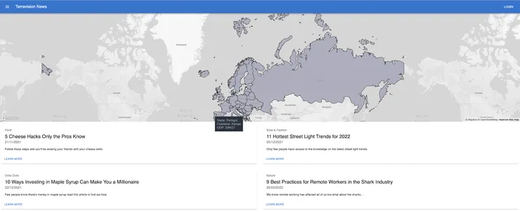
As you can see we now have a polygon layer displayed on our map but none of the additional information included in the geojson is visible to the user. Most of deck.gl’s layers can be configured to display tooltips on top of the layer. The pickable prop that I added to the PolygonLayer allows the deck.gl component to access all the additional information and adding a getTooltip prop to your deck allows you to manually configure the structure of your tooltip.
getTooltip={({ object }) => {
if (object) {
    const typedObj = (object as unknown) as {
    properties: { story?: string; scalerank?: number; sovereignt?: string; level?: number; type?: string; geounit?: string; subunit?: string; name?: string; name_long?: string; economy?: string; continent?: string; pop_est?: number; gdp_md_est?: number; income_grp?: string }
    };
    if (typedObj.properties.continent) {
    return `Name: ${typedObj.properties.name_long}\nContinent: ${typedObj.properties.continent}\nGDP: ${typedObj.properties.gdp_md_est}`;
    } else {
    return `City: ${typedObj.properties.name}\nStory: ${typedObj.properties.story}`;
    }
} else {
    return null;
}
}}
Now you can see any specific data that you want when the user hovers over a certain section of the map. Without any need to specify coordinates, boundaries etc. Everything is handled for you.
The last feature we need to add to our map is an icon layer showing where the stories we have on our site come from. In the same saga I mentioned earlier we need to instantiate a new IconLayer class.
// Initial story data that could be pulled in from database
 const pointData = [
   { properties: { name: 'Chavignol', story: '5 Cheese Hacks Only the Pros Know' }, coordinates: [2.844560, 47.397411] },
   { properties: { name: 'Milan', story: '11 Hottest Street Light Trends for 2022' }, coordinates: [9.195585, 45.467905] },
   { properties: { name: 'Kyiv', story: '9 Best Practices for Remote Workers in the Shark Industry' }, coordinates: [30.479160, 50.44044] },
   { properties: { name: 'Zurich', story: '10 Ways Investing in Maple Syrup Can Make You a Millionaire' }, coordinates: [8.519453, 47.385598] },
 ]

 // Icon layer based on the story data above
 const layer = new IconLayer({
   id: 'icon-layer',
   data: pointData,
   pickable: true,
   iconAtlas: 'https://upload.wikimedia.org/wikipedia/commons/e/ed/Map_pin_icon.svg',
   iconMapping: ICON_MAPPING,
   getIcon: d => 'marker',
   sizeScale: 15,
   getPosition: d => (d as { coordinates: Position2D; exits: number }).coordinates,
   getSize: d => 5,
   getColor: d => [50, 168, 82, 255],
 });
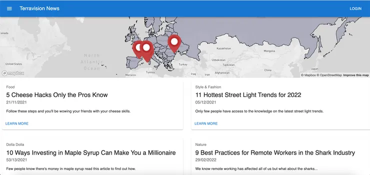
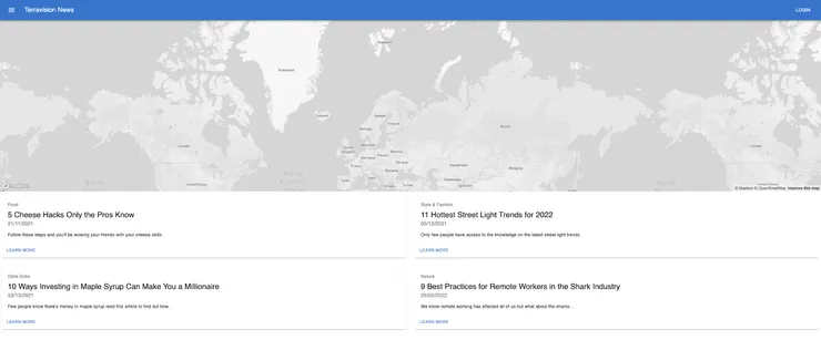
The result is a map containing information about both the countries we’ve specified and the stories on our site.
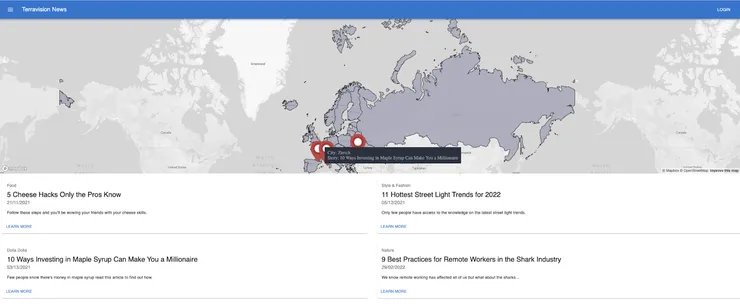
Note: In the real world we would have the icon layer pull from a database so that it’s automatically updated on publishing of a new blog.
Technical Deep Dive
You’ve now seen how easy it is to display rich maps using deck.gl and Carto. I want to take some time to talk about what makes them such interesting pieces of software. In the world of geospatial analysis there are some standard data formats (GeoJSON, Shapefile, KML, CSV, etc) and ArcGis is considered to be at the forefront of the geospatial data handlers. You can think of an ArcGIS server as blob storage with an API for processing and access (although in reality it’s A LOT more complex and feature rich). The ArcGIS server is configured to interpret and process data in a geospatial format and make it easy for developers and analysts to use it where appropriate. Carto can act as both an intermediary or a replacement for ArcGIS. But using it as part of your stack can vastly optimise your load times and improve developer/user experience due to the way it handles your geospatial data.
The Power of the_geom
Let’s talk through another example, you want to create a polygon layer to display on a map of Europe to show the most recent population of each country. To generate this you would need three things:
- A map of Europe - https://www.mapbox.com/
- The contour data defining the boundaries between countries with a relatively high degree of precision - https://www.kaggle.com/sudhirnl7/human-development-index-hdi
- The population data tied to each of the contours for a country - https://www.kaggle.com/sudhirnl7/human-development-index-hdi
So now you have the data, where will you store it? Well for a single country you will likely have millions of data points outlining its boundaries which can amount to ~1GB of data for each country. There are 44 countries in Europe. Now you have to load ~44GB for the user each time they want to see this visualisation. Carto offers a great solution to this. Instead of storing the contour data for a country on a point-by-point basis, it takes the data you’ve scraped from the internet (GEOJSON for example), ingests it and converts it into what they call the the_geom. This compresses millions of data points into one, which can easily be queried, manipulated or converted back into the GeoJSON format all using standard SQL commands. Now you’ve gone from having to load millions of rows of data to only 44.
So we have our data compressed and stored on the Carto servers which can easily be accessed using the Carto API, now we need to figure out how to get it displayed on our map.
More tiles than the kitchen floor
On the homepage deck.gl states it’s a webgl powered framework for large scale datasets. Given how the size of geospatial datasets can quickly grow, having a library that can process and handle large volumes of data on the web is key to building an application with a good user experience. Some of the features I find most interesting are:
- Loading Data: Deck.gl is built on top of loaders.gl which is a library the same team built dedicated to handling the loading of large amounts of data. Providing loaders for geospatial, csv, json, vector, image files and more. Leveraging the loaders.gl library means that the load times of large datasets can be kept to a minimum with ease.
- Bundle optimisation: Another interesting trait of deck.gl is that it’s built with web developers in mind. Hence features like tree shaking can also be easily configured to keep your bundles as small as possible.
- 64-bit layers: Given that there are so many use cases for deck.gl the software is built in such a way that it can handle visualisations for many scenarios. The use of emulated 64-bit floating point means that the precision and detail of the visualisations is incredibly high. This means if your data goes down to the centimeter scale then the user will have no issues zooming in to that level.
The End…?
So you’ve now seen how easy it is to add data rich map visualisations to your web applications. You can see all the code I used to build my demo app here and the link to the actual site TerravisionNews 2021. Any questions feel free to get in touch, PRs/comments welcome.