How FlexBox has (not so much) changed my life
Oumar Fall9 min read

When times are hard, I sometimes settle down and think back to my recent debut on the web. Nostalgic, I think back to the very first web course I attended. A course on HTML code, an introduction to CSS, and a presentation of Bootstrap, that’s all. What marks me with hindsight, it’s not so much the fact that it’s quite sad to discover the web this way given the richness and diversity brought by all the frameworks that already existed at that time. Without talking about frameworks, even a few lines of Javascript could have made it much more interesting. No, what marks me are those hours spent trying to understand CSS positioning.
”Why is an element with an absolute position positioned relative to its closest ancestor having a relative position? How can an element have a relative position if I don’t specify what it is relative to”. It’s all those hours spent looking for THE property that will magically give the rendering I want without destroying the rest of the style of the page. Those are the moments when proud to finally have the visual I was looking for, I decided to share the code with friends and finally realized that a slight difference in screen resolution sent me back to square one.
This until a new web course, one year later. HTML, CSS, a bit of javascript, nothing transcendental. First lab session, I was asked to place frogs on water lilies using Flexbox. “What’s that joke?” would you say? Well, that’s when FlexBox was about to change my life.
Disclaimer
The purpose of this article is in no way to sell the FlexBox framework or to promote it ,since it is universally known. Its only purpose is to share my experience and my personal misadventures related to the CSS positioning and the use of this framework, all in a humorous and playful tone. On that note, enjoy your reading!
History of the css positioning
CSS Flexible Box Layout Module (or FlexBox) appeared with the arrival of the CSS3 module at the end of the 2010s. At the same time CSS Grid Layout, also very widespread, appeared. But I will not discuss it here. The emergence of these layouts was motivated by the popularization of “liquid layouts” (which adapt to the page and reorganize themselves dynamically) as well as responsive interfaces to adapt to the diversification of media sizes (with the increase in screen sizes and the emergence of smartphones).
Previously, developers had to rely on javascript frameworks dedicated to the design of interfaces such as Bootstrap, or manage with existing CSS properties (relative sizing using % units, media queries, …).
“Vanilla” CSS positioning is based on 3 main properties: display, float, and position. Anyone who has already made a web interface has already played with these three properties to get the desired UI. Out of nostalgia and for science, I decided to take an interface made with FlexBox and try to reproduce it as faithfully as possible using these properties.
Comparison
Although React appeared after FlexBox, I allow myself to use React and styled-components for reasons of comfort and simplicity. So I took a whole page from a project I recently worked on and challenged myself to reproduce it as faithfully as possible using the native CSS positioning properties.
So I’m going to base my comparison on several criteria: appearance, number of lines, responsiveness, and uniformity across browsers. I will also be interested in more subjective characteristics such as code clarity or complexity.
Aspect
First we will compare the appearance of the two pages.
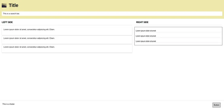
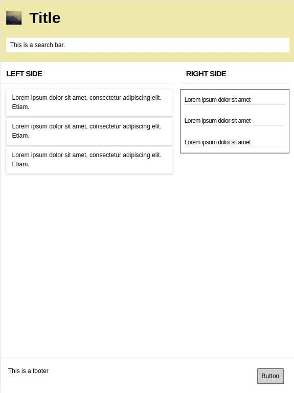
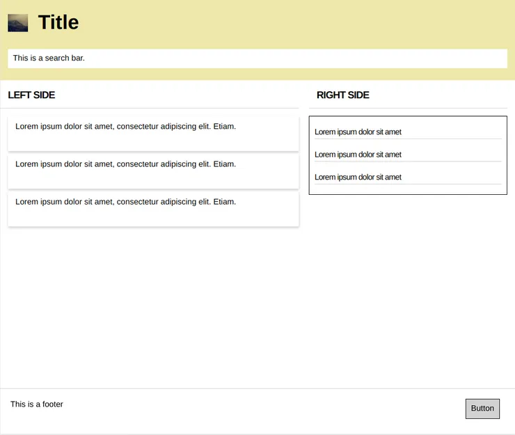
Target (With FlexBox)
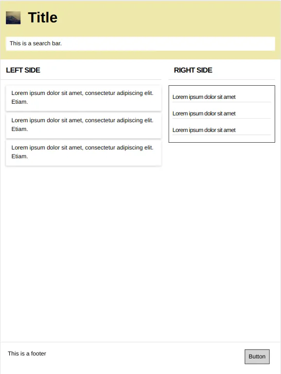
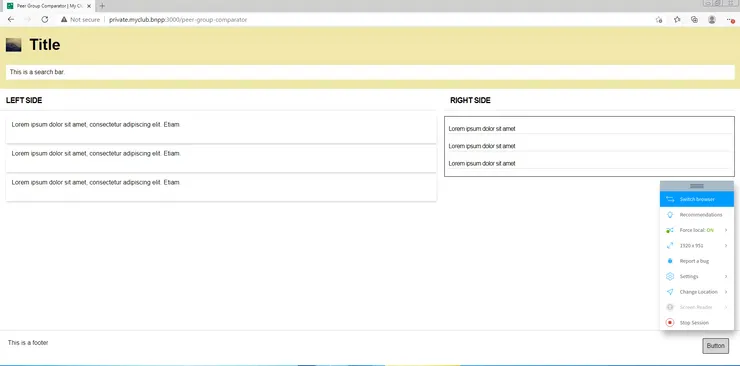
Result (Without FlexBox)
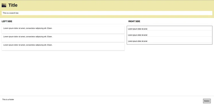
From the point of view of appearance, we can see that the result is quite close to the objective. The only noticeable difference is the spacing between the elements on the right-hand side which is not the same on the two images.
On this point, we can say that it is possible to manage without FlexBox. But at what cost?
Code length
We will now compare the length of the code in both cases. First of all, on a simple element like the header, the CSS code looks like this:
With FlexBox
import styled from 'styled-components'
export default {
    Header: styled.div`
        width: 100%;
        height: 160px;
        padding: 25px 15px;
        background-color: palegoldenrod;
        display: flex;
        flex-direction: column;
        justify-content: space-between;
        align-items: flex-start;
    `,
    TitleContainer: styled.div`
        display: flex;
        flex-direction: row;
        align-items: center;
    `,
    Pictogram: styled.div`
        background: url('https://picsum.photos/id/475/400/350') no-repeat;
        background-size: cover;
        width: 40px;
        height: 35px;
    `,
    Title: styled.span`
        font-weight: bold;
        font-size: 40px;
        line-height: 40px;
        margin-left: 20px;
    `,
    SearchBar: styled.input`
        background-color white;
        width: 100%;
        padding: 10px;
    `,
    }
Without FlexBox
import styled from 'styled-components'
export default {
    Header: styled.div`
        width: 100%;
        height: 160px;
        padding: 25px 15px;
        background-color: palegoldenrod;
        position: relative;
    `,
    TitleContainer: styled.div`
        position: relative;
    `,
    Pictogram: styled.div`
        background: url('https://picsum.photos/id/475/400/350') no-repeat;
        background-size: cover;
        width: 40px;
        height: 35px;
        display: inline-block;
        position: absolute;
        top: 50%;
        transform: translateY(-50%);
    `,
    Title: styled.span`
        font-weight: bold;
        font-size: 40px;
        line-height: 40px;
        margin-left: 60px;
    `,
    SearchBar: styled.input`
        background-color: white;
        width: 100%;
        padding: 10px;
        position: absolute;
        bottom: 0;
    `,
    SearchBarWrapper: styled.div`
        position: relative;
        height: 70px;
    `,
    }
We can see that the code without FlexBox has 3 more CSS properties (25 against 22) and one more element (a wrapper around the SearchBar).
On the whole page, the code without flexbox has 2 more lines (108 against 106) and 1 more element (17 against 16). Finally, here again, CSS code without FlexBox is not longer than CSS code with FlexBox.
Responsiveness
However, as I stated earlier, one of the reasons for the existence of FlexBox is its “liquid” nature. It is a layout that came into being with the diversification of responsive interfaces. It is therefore interesting to see if our example can highlight this property. To do so, we will observe the rendering of our interface for different screen sizes and ratios.
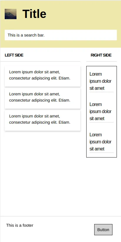
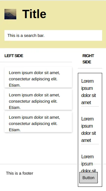
With FlexBox
Large Laptop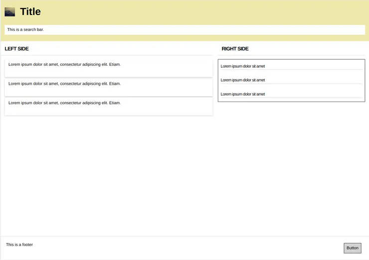
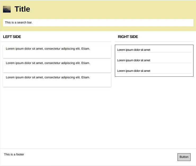
Without FlexBox
Large Laptop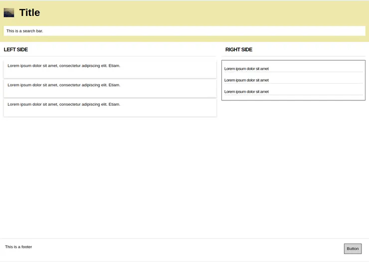
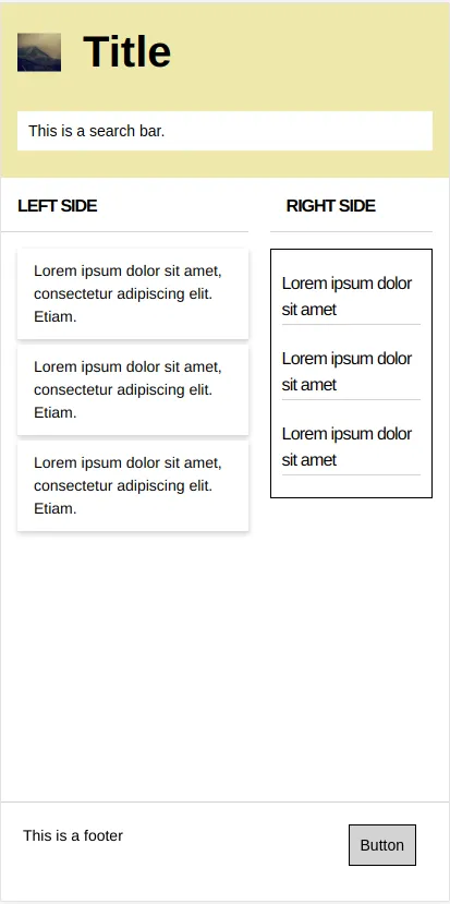
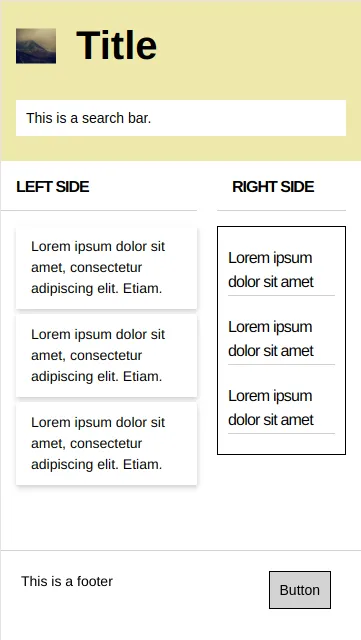
Surprisingly enough, we notice that our interface behaves well (or even better) without FlexBox when we reduce the screen size. However, problems that occur on a too-small screen with FlexBox are easily adjustable. We can therefore note that for simple, rather geometrical interfaces like ours, the UI behaves relatively well when the screen size and ratio changes.
Uniformity
Another criterion that might be interesting to look at is uniformity across browsers. Indeed, the behavior of a CSS code can be quite different on Chrome, Internet Explorer and Edge. So I decided to observe the rendering of the same interface on these three browsers.
With FlexBox
IE11

Without FlexBox
IE11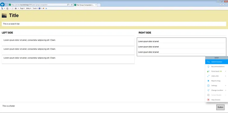
Once is not customary, against all my expectations, there is no difference between the behavior of the style on different browsers. I even have my doubts. Flexbox would just be a masquerade and would have no advantage? Have I become an expert in pure CSS? Joking aside, the fact is that my user interface here is quite simple, quite structured, square. So the power of flexbox is not being expressed at its true value. I don’t think I’ve chosen the most suitable example.
Personal feeling
In the end, in this experience, the only notable difference I was able to raise is quite subjective and concerns my personal feeling about the clarity and complexity of the code. Although it is difficult to quantify these criteria, I felt a real difference when coding.
Code complexity
As far as the complexity of the code is concerned, if I refer to the time I spent on it, the handling of the two methods is quite different. The code with flexbox is quite intuitive. Once the necessary time has been spent getting familiar with the tools, the development flow is fairly fluid and fast and requires very little adjustment. Conversely, without FlexBox, the properties are basic CSS properties but I find the development flow much less reliable. The code requires a lot of adjustments, especially when it comes to making the interface stable on different media and different browsers. I feel a bit like cooking or doing magic.
Code clarity
In terms of clarity, it’s again subjective but the code is much clearer in my opinion by using flexbox. The property names are self-explanatory and it’s easy to understand the interface structure or change an alignment at a glance. Moreover, I have experienced this by taking code I wrote in my early school days (without FlexBox) and trying to understand it and modify it a bit. Apart from the lack of rigor in the writing and the structure of the code in general, I had a lot of trouble making slight modifications to the alignment or the ordering of my interface. On the other hand, I took more recent code (with FlexBox) and I had much less difficulty reworking it.
Review
Finally, even if my experience doesn’t show it so much, FlexBox is known to have revolutionized liquid layouts and responsive interfaces. It has replaced the overuse of media queries, relative units (%, em, …), or javascript to dynamically change properties. As a reminder, I don’t consider myself an expert in CSS (far from it). There are most likely better ways to do things without using FlexBox. This article has no scientific value and is only intended to report on my personal experience.
My aim was mainly to show you how FlexBox has (not so much) changed my life.
The ultimate irony: For someone writing an article on CSS positioning, if only you knew how much time I spent to position my images for comparison…