Build an Animated Accordion List in React Native
Benjamin Piggin7 min read

Accordion lists (or ExpandableListViews) are now a material design staple and show up in quite a few apps. They are a great way to dynamically display information to a user.
When it comes to implementing one in your own app, sure, there are libraries that you can use. But implementing one yourself gives you greater control over styling, a smaller app bundle size, and it’s so easy it might even be faster! It’s also a great opportunity to sharpen your skills using React Native Hooks and the Animation API.
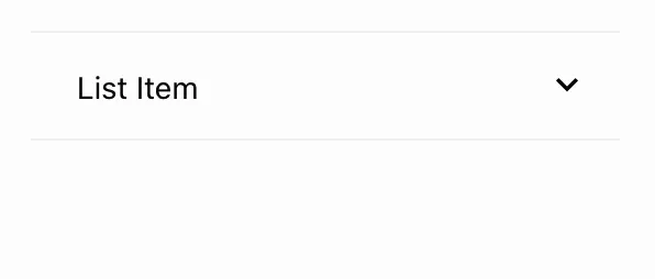
This is what we’ll be creating:

Just show me the code!
Alright, alright! Here’s a snack. Consider sticking around though - you might learn something.
Let’s get started
First off we need a functional component. This will take two arguments or props:
- A
string. The title in the top bar of the list item. - A
ReactNode. The component in the expandable section.
For the second of these, React allows us to access child components via this.props.children in class components, or we can specify children as an argument to our functional component. Magic!
So our functional component has the form:
const AccordionListItem = ({ title, children }) => {
 ...
};
export default AccordionListItem;
And we can use it like so:
<AccordionListItem title={"List Item"}>
  <Text>Some body text!</Text>
</AccordionListItem>
The top bar of our list item will need to be wrapped in a TouchableWithoutFeedback since we want users to be able to open and close the list item by pressing it. This can contain the title we passed in via props.
<TouchableWithoutFeedback>
  <View style={styles.titleBackground}>
    <Text>{title}</Text>
  </View>
</TouchableWithoutFeedback>
Now let’s add a View for the list item body. This is the section that slides in and out when the header is clicked, and will contain our child component.
<View style={styles.bodyBackground}>
  {children}
</View>
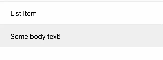
Let’s see what we have so far:

Nothing revolutionary right? Bear with me, here’s where it gets interesting!
Now I’m hooked
Next up we’ll want to add a few React hooks to keep track of the state of our component. Here they are:
- A
stateto keep track of whether the item is open or closed. - An
Animated.Valueto animate the opening and closing of the body section. - The height of the body section - this is what we will be changing in order to show and hide it.
Or in code form:
const [open, setOpen] = useState(false);
const animatedController = useRef(new Animated.Value(0)).current;
const [bodySectionHeight, setBodySectionHeight] = useState(0);
Note that we’re using useRef to create the animation object. Since our open state will persist across component refreshes, we want our animated value to do the same, otherwise they’ll get out of sync! useRef acts as a sort of state container for our Animated.Value, elevating it out of the component lifecycle.
Accordion time!
Now we need to tie our Animated.Value to the height of the body view. Our animated value can vary over whatever range we want but it’s easiest to pick a simple range like [0, 1]. Here, 0 maps to the list item being closed and 1 to it being open. As the animated value changes from 0 -> 1 we want the height of our view to go from 0 -> bodySectionHeight. To achieve this we can use the interpolate function:
const bodyHeight = animatedController.interpolate({
  inputRange: [0, 1],
  outputRange: [0, size.height],
});
Which simply maps the inputRange to the outputRange exactly as we described. When we change the value of the animatedController, the bodyHeight variable will scale this value relative to the height of our container. With all this set up, we can now write our toggleListItem() function, which will be called when we click on the item header.
We can think about what this function has to do as follows:
- If the list item is open: a. Change the animated value from 1 to 0. b. Set the state to closed.
- If the list item is closed: a. Change the animated value from 0 to 1. b. Set the state to open.
const toggleListItem = () => {
  if (open) {
    Animated.timing(animatedController, {
      duration: 300,
      toValue: 0,
    }).start();
  } else {
    Animated.timing(animatedController, {
      duration: 300,
      toValue: 1,
    }).start();
  }
  setOpen(!open);
};
I’ve set the duration to 300ms, but you can play around to find your preferred speed.
We’re getting pretty close. We’ll need to make our View an Animated.View in order to use React Native’s animation system, and then set the height of the animated view to be the bodyHeight variable.
<Animated.View style={[styles.bodyBackground, { height: bodyHeight }]}>
  {children}
</Animated.View>
Now for a sneaky step. We need to set an initial value for the height of our bodyView so we know what value to return when we open the list item. But, we can’t use the height of the animated view. This is because we are going to set the bodyHeight using the onLayout prop of View. For an animated view this is called many times while the view is animating! This is no good for us, we just want to set it once.
To fix this we can nest another regular view in our animated view which can have a constant height. We can then use this view’s height for the value of bodyHeight.
onLayout takes a function with an event parameter. We access the components height via event.nativeEvent.layout.height. So, putting it all together:
<Animated.View style={[styles.bodyBackground, { height: bodyHeight }]}>
  <View onLayout={setSize} style={styles.bodyContainer}>
    {children}
  </View>
</Animated.View>
Finally we need to set the overflow: “hidden” property on the bodyBackground style. This tells the children of the animated view what to do if they overflow the views box, which is exactly what will happen when the list item is closed. Setting this to hidden means they won’t be visible, perfect!

Realistic slide
What we have is nice, but it would be great if we could give the impression that the body of the list item is unfolding from the title bar. Fortunately there’s an easy way to achieve this! We can add the following properties to the bodyContainer style:
position: "absolute";
bottom: 0;
This ensures that the bottom of the inner view is always aligned with the bottom of the outer view, meaning the inner view should slide nicely up and down as the list item opens and closes.
Spinning arrows
Another nice feature would be to have an arrow indicator that rotates as the list item opens and closes. With our new knowledge of React Native animations, this should be easy! As our animated controller varies from 0 -> 1, we want the angle of our arrow to vary from 0 -> π radians or 0 -> 180° for regular folks. Using the same animated controller means it will always be in sync with the opening and closing. So we have:
const arrowAngle = animatedController.interpolate({
  inputRange: [0, 1],
  outputRange: ["0rad", `${Math.PI}rad`],
});
Then we can add our chosen arrow icon, within an Animated.View, into our title container view:
<View style={styles.titleBackground}>
  <View style={styles.titleContainer}>
    <Text style={styles.titleText}>{title}</Text>
    <Animated.View style={{ transform: [{ rotateZ: arrowScale }] }}>
      <DownArrowSVG width={20} height={28} />
    </Animated.View>
</View>
Here we have used the transform CSS property to pass in a z-angle of rotation for the view (in other words, the angle perpendicular to the z-axis - I had to work this out by trying rotateY and rotateX first!).
Take it Easing
One for the true perfectionists out there. React Native allows us to change the velocity of the animation via the easing parameter. This is a subtle change in our case, but it’s a good habit to get into as it can make a big difference in feel for some animations.
Most of the time I use the standard Material Design easing:
easing: Easing.bezier(0.4, 0.0, 0.2, 1);
Putting this in both our Animated.timing configs, we get our finished product!

Even after all that work our list item is less than 1kb in size once gzipped! I challenge you to find a library that’s smaller. We also have complete control over every aspect of our styling. Stick this in a FlatList component to create a nice scrollable list, or you can just stack them like regular components if you only need a few. Have fun with it!


