Web Accessibility Check Using the RGAA Guidelines
Albéric Trancart10 min read
Web accessibility (a11y) can be a little disorienting for everyday developers. Here is a practical, down-to-earth guide with examples to help you make your websites more inclusive and comply with legislation.
Why is accessibility important?
There are three main reasons why you should make your apps and websites more accessible:
- Inclusiveness: accessibility is making your site usable by the widest range of people, and not exclusively screen readers. For instance, there are more color-blind people (4.3%) than Internet Explorer/Edge users (3.3%). Furthermore, disabilities can be temporary or situational, so a more accessible Internet helps everyone.
- SEO: although this is only a small factor for SEO, well-structured content will be easier to read and easier to parse for search engines.
- Legal: even if you don’t care about the two points above, making your code accessible is now a legal obligation. US websites must comply with the WCAG standard and EU websites (for all public agencies and private companies with revenues over 250 million euros) to the EN 301 549 V2.1.2 norm.
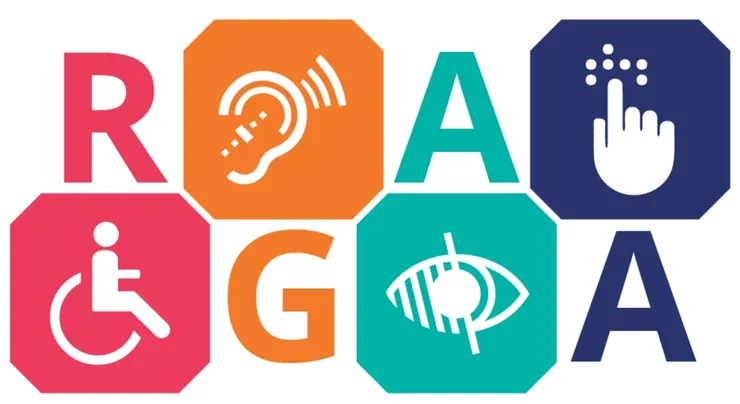
What is the RGAA?
The RGAA is the French government’s official guide to improving accessibility. It features a verification method, tests, and checks to enforce both the WCAG 2.1 AA standard and the EN 301 549 V2.1.2 norm.
You can download it here (link in french): Référentiel général d’amélioration de l’accessibilité.
However, it is not so easy to digest - there are 13 categories of criteria across 120 pages. Let’s break it down category by category to get the essential information.
I recommend that you audit one of your web pages while reading this article to put it to practice. I made a nice printable a11y checklist for you to follow along. You also may want the HTML tags reference page opened in another tab. That will come in handy for understanding the role of HTML tags you may not know or improve your knowledge of the ones you already know.
Disclaimer: following these rules will not guarantee that your site is 100% accessible. It will not replace real user tests. It will make your site easier to navigate for everyone, though.
RGAA check categories
Let’s go! To give some examples, I’ll use Falco, Theodo’s open-source WebPageTest runner and SpaceX Stats, my space-themed project as test dummies.
Warning: checking each category changes a lot from page to page and can take some time.
Images
People using screen-readers should be able to understand the content without the visual information provided by the images.
- All meaningful images must have a relevant text alternative.
<img>tags must have analtattribute while<svg>,<canvas>,<embed>,<object>and tags withrole="img"must have aaria-labelattribute. - Decorative images should be hidden with an empty
alt=""attribute for<img>tags oraria-hidden="true"for other tags. - Images required to understand the content point to a description with
aria-describedby. - Images containing text (memes are a perfect example) have a text alternative containing the text of the image
- If the image has a legend, it must be in a
<figcaption>tag - If the image is a CAPTCHA, there is a non graphical alternative to the CAPTCHA
Bad example: this image has a wrong alt attribute, it is not relevant to the image
Bad example: this image should have alt=""
Bad example: this svg should be aria-hidden="true"
Colors
Good colors and contrast are especially important for color-blind people, people with vision conditions such as myopia or simply all users over the age of 40.
- Choose colors with a high enough contrast
- Text smaller than 24px should have a 4.5:1 ratio (don’t forget video subtitles and text on images)
- Text bigger than 24px and UI elements such as icons, borders, buttons, charts… should have a 3.0:1 ratio
- There are exceptions: elements in their disabled state, logos, decorative text, inputs with native browser styles are not subject to this rule
- Colors should not be the only mean of conveying the information, such as chart colors or medical diagrams. For instance you could use different chart line styles or provide a long description.
You can check color contrast in one click with this extension: WCAG Color Contrast Checker for Chrome, WCAG Color Contrast Checker for Firefox.
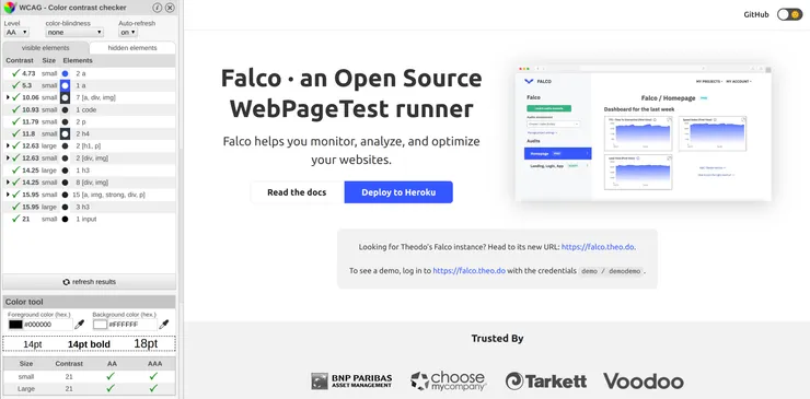
Good example: Falco is OK for color contrast
Here is an article on how Stripe chose its color palette to meet these criteria.
Content
A well structured content is easier to understand, especially for people with screen readers.
- The
langattribute is set on the html element - The titles
<hx>structure is relevant (do not skip heading levels) - There are
<header>,<footer>,<nav>,<main>,<article>,<section>and<aside>elements when relevant - All links have relevant wording or title attributes for composite links (images as link…)
- List contents are using
<ul>/<ol>/<li>/<dl>/<dt>/<dd> - Quotes are using
<blockquote>for long quotes and<q>for short quotes - Each
<iframe>has atitleattribute describing its content - Cryptic content, emojis, ASCII art… have text alternatives
- The HTML is valid.
- You can understand the page with a screen reader only.
For screen-reading, you can use VoiceOver on macOS or this Google Chrome extension if you prefer Linux like me.
To validate your HTML, you can enter your URL or copy-paste the generated HTML into the official validator.
Bad example: the text given by the screen reader is difficult to understand, and it’s even worse when it’s read aloud
CSS
Aging people often use zooming features,
- The content is still readable if I disable CSS
- The website is still usable if:
- I set the
font-sizeto 200% or use the browser zoom to 200% - I set
line-heightto 1.5rem,marginbetween<p>to 2rem,letter-spacingto 0.12rem,word-spacingto 0.16rem
- I set the
- There should be no horizontal and vertical scrolling at the same time on a page (that would translate to “no horizontal scrolling” on normal websites)
- The website should be readable in landscape and portrait mode (exceptions: apps such as games, etc)
A quick code snippet you can paste into the devtools in the <html> element to check text resizing:
font-size: 200%;
line-height: 1.5rem !important;
letter-spacing: 0.12rem !important;
word-spacing: 0.16rem !important;
Bad example: the layout is broken…
Navigation
Keyboard navigation is important for users with motor disabilities, people having tremors, blind users but also power users of the website.
- You can use every feature of the page with the keyboard only
- Every hidden content has
display: noneor set aaria-hidden="true"attribute - Focusable elements have a focused style, and it is not only a color change
- At least two navigation systems exist: menus, sitemap, page search (exceptions: small enough sites where browser search acts as a page search)
- Navigation systems are at the same place from page to page
- There is a “Skip to content” link as the first focusable element
Bad example: the outline is disabled on this link
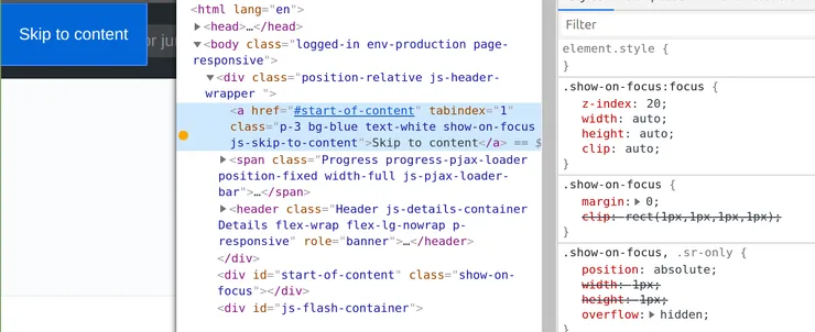
Good example: you can steal GitHub’s “Skip to content” link. Hidden by default but it’s the first focusable element and it appears if you Tab into it.
Media
Media often convey a lot of information that can’t be accessed with visual or auditive conditions.
- Use native
<audio>and<video>players, no other technologies such as flash - Provide subtitles with
<track kind="captions">to both audio and video content (don’t forget user-uploaded content!) - Other types of media (carousel, slides, etc.) must have textual alternatives
- Do not autoplay media
- Downloaded files should be accessible or have an accessible alternative
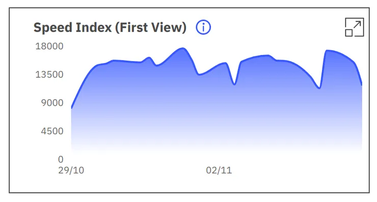
Bad examples: both Falco and SpaceX Stats are using charts with no tabular alternative. Here are some examples of accessible charts with Highcharts
My opinion: providing text alternatives to complex media such as videos and charts is clearly the hardest criteria to meet. My personal strategy would be to limit the usage of such media and to have a text with a similar level of information in descriptions labeled with aria-describedby. When having user-uploaded content, you should encourage your users to provide a long description too. However, when these media are the main focus of the website (such as YouTube or TED), you can’t escape the need for captions.
Tables
A well-structured table is important for screen readers, as a badly structured one can become really confusing.
<table>is used to display tabular data and only tabular data- The table is described by a
<caption>tag - The table has a
titleattribute - The table has
<th>row and/or column headers - Every cell is linked to its header by putting
scope="rol"/scope="col"on the<th>elements or by linking<td headers="super-header-id">with<th id="super-header-id">
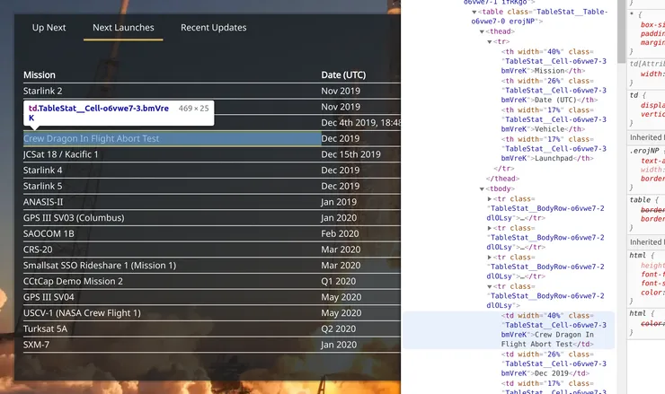
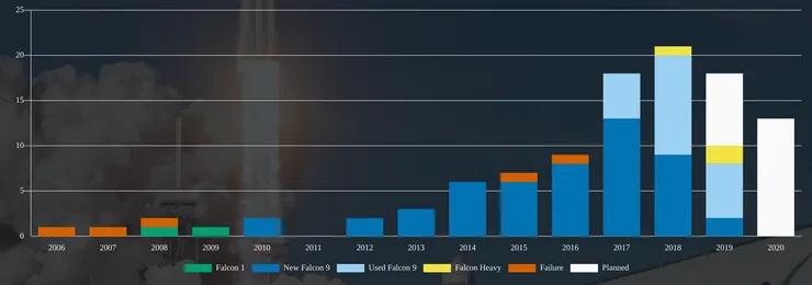
Bad example: this table is missing a caption and could use row headings on the mission names
Forms
Forms are sometimes complex to understand and to navigate, and it is even worse for people with screen readers or using keyboard navigation.
- Every input has an associated label with
<label>,aria-labeloraria-labelledby. - Labels are close to related inputs
- Fields of the same nature are grouped in
<fieldset>tags (example: radios, checkboxes) - Every
<fieldset>has a<legend> - Every choice input with options uses a
<select>component (no custom selects!) or ARIA comboboxes. - Avoid using the
autofocusattribute on inputs. Screen-readers jump straight into the input without any context about the form. The only valid way to use it is when it doesn’t disrupt navigation: for instance, Google’s search input on the landing page has it (because it is the only thing in the page) but not the one on the results page (which has way more content). - Forms with juridic or financial consequences (such as a checkout form) can be reviewed after the form has been validated and before the action is submitted
- User info related fields have an
autocompleteattribute configured. Read the docs on MDN about autocomplete.
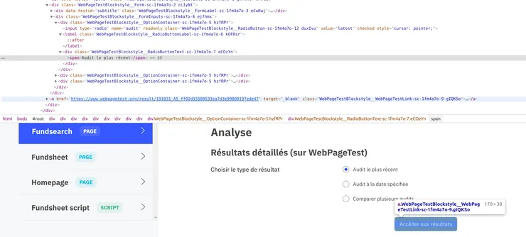
Bad example: radio buttons should be placed inside a <fieldset> with a <legend> and radio inputs are not linked to their labels.
Dynamic content
- Time limits can be controlled or disabled (refresh/redirect/session timeouts, other timeouts). Imagine a bank website automatically logging off users after 15 minutes or an event website selling tickets with a time limit in the checkout form. Some users wouldn’t be able to navigate the website and use it in that amount of time.
- No window is opened without the user’s intervention
- Every change of context (new window opens, focus is changed, page is changed) is triggered by a button, a submit input, a link or an element with a text warning in advance of the context change.
- Rapid flashes (video, animations) must have a frequency of less than 3 per second or cover an area smaller than 21 824 pixels
- Every animation lasts less than 5 seconds or can be stopped (slideshows for instance)
- Every multitouch action can be triggered with single touch actions
- Features requiring device movement have nonphysical alternatives (example: shake your phone to play a random tune). Exceptions: this criteria is irrelevant when an alternative is impossible: gyrometers, pedometers…
- ”Toaster” messages have a
role="status",role="alert",role="log"orrole="progressbar"attribute.
You can turn off animations if the user has opted-out of them with the prefers-reduced-motion setting.
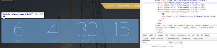
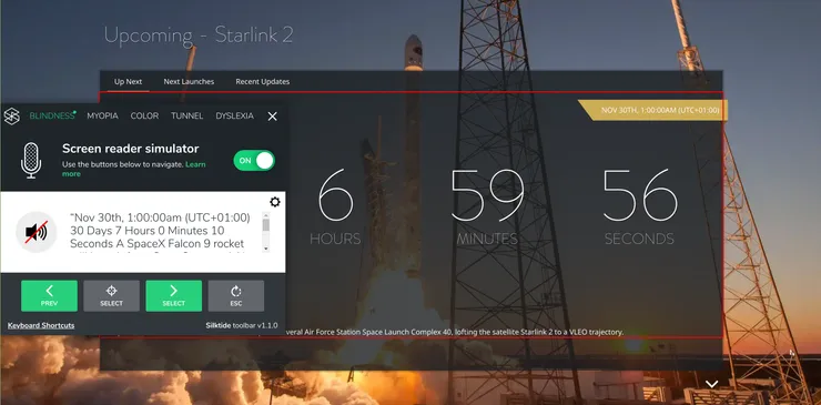
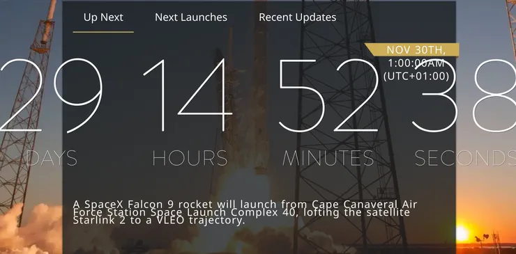
Bad example: SpaceX Stats has countdowns, which update the text every second. Such a time-dependent content should use the ARIA timer role.
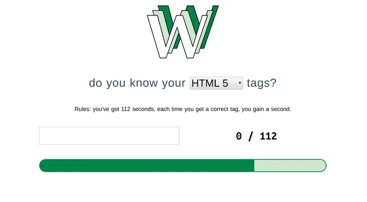
Bad example: this funny website to test your HTML knowledge is not accessible at all because many people will not be able to take the test in 112 seconds. One way to improve this would be to provide different levels of difficulty, the easiest being “no time limit”.
Conclusion
I hope that this article helped you audit your website and understand what should be improved to make it more accessible. For me, it was a wake-up call that I needed to re-learn some of the web basics (such as proper HTML semantics). The web is transforming our society, its inclusiveness should be a default and not a bonus.