Wow your customers with simple UI & UX principles
Tomas Piga9 min read

When it comes to the web, the main idea of a website or app is to either sell a product (including services) or be that product. Generally, a product is about delivering a message or some sort of value to a User. Many people don’t value the U in that sentence.
User experience is about maximising the power of your message and how you can convey information to users in the most effective way. It’s about reducing the friction between the entire product interface and its user. Defining, structuring, and optimising your message eliminates wasteful decisions. As an assistant, a good user interface design will convey each part of the message simply and effectively.
UI + UX isn’t rocket science. It’s fairly straight forward unlike a lot of articles tend to preach. My inside developer perspective aims to give some key principles you can stick to with a flash of practical state-of-the-art to show applications. I want to help you make a great product.
User Experience (UX)
… the two sides
The first thing you need is to understand your product and its user. You need to know what the user will find useful and your role in providing that.
UX design is about enhancing the experience of the user so therefore your user demographic should form the heart of every decision. To understand them, you need to determine
- What value are you providing the user?
- What does the day of the user look like and where does this product/service fit?
- What characteristics are important to your demographic?
This should give you the theme of your product and what you should focus on. Some users value security, meanwhile others prefer ease of use, or affordability. At Theodo, we’ve reaped the rewards of doing a lot of user testing at the beginning of a product which avoids exponentially increasing waste later down the line.
If you know your user, and you know your goal, establishing a quantifiable Key Performance Indicator (KPI) enables you to:
- Measure progress and how well you’re delivering your objective
- Make better decisions about how to improve it
- Prioritise features to bring the most value to your clients, not just on what you think is important
This will give you a goal that you can optimise (for example: your conversion rate, or average time spent on the site).
… achieving good UX
Once you’ve established your fundamentals, you can start building. Depending on your context, here are examples of what you’ll be able to do:
- For a website - structure your steps to have the highest conversion rate
- For a product - prioritise features to out-deliver your competitor in value
- For a mobile app - persuade your user to retain their engagement
This is already delivering a good and focused product, but to make it great, you need to understand that that you’ll never be able to get the complete picture or there will always be some misunderstanding. It’s crucial to keep involving the user throughout the development process to review, reflect, and iterate to keep eliminating wastefulness as early as possible.
To measure your success, you could add a web analytics tool such as Google Analytics to your website. This will allow you to track usage of your site. Deciding to track an event or click takes developers just one line of code, but this can be the indicator that tells you whether a feature has an impact or whether no one ever touches it. If you’re not sure about a particular feature or idea, you can combine analytics with A/B testing (releasing a change to a subset of your users first) to see its value. Then, if you discover a problem, you can go back to the user and investigate the issue.
Interface Design (UI)
The principles
- Stay simple. The goal is to eliminate confusion. You want to describe a product in steps, not all at once, like a conversation. For apps, you want to stay focused and stop cluttering the interface by hiding options that won’t be commonly used.
- Keep consistent. Usability comes from familiarity. Keeping consistent with current standards makes it easy for new users to pick up an app, while sharing designs across pages reduces confusion and increases ease-of-use. Consistency across products builds brand awareness.
- Develop character. Don’t over-follow competition as your product needs to stand out. Connect to the user to build a persona of your product and make the interaction more human than just exchanging cash.
- Consult the latest and greatest. Much like companies consistently innovate new features, designers consistently create. The ‘correct’ approach evolves and there’s always new ways to deliver information either simpler, or in a more exciting way. There are always fantastic examples online which can really help for inspiration if you’re unsure where to go.
… and their implementation
The structure of a product website commonly delivers information broken down into digestible pieces by using full-height pages. The user scrolls down instead of clicking to see each new page and message. The first 1080p serves a splash screen which visually contrasts against the rest of the website and engages the user to read more. Half of the page usually belongs to a picture that visually describes the message. Points are accompanied by icons to make them more memorable and interesting. Inside an app it’s key to deliver the most value with the least space because the smartphone screen is small compared to desktop.

Facebook’s React library brings with it an open-source community and tons of design collaboration. Component libraries allow you to implement any common web functionality consistently whilst at the same time saving you massive time on detail. Don’t worry, there’s plenty of option in case you are sick of Google’s Material UI:
- BlueprintJS
- React Strap
- Ant Design
- Grommet
- Bootstrap
Today the ‘flat design’ pattern is standard. Even though it’s been around a while, its minimalism still dominates current styles. A single-colour, cleanliness, and open space are its 3 main characteristics. Backgrounds should be simple and avoid shading. Components should have big margins and padding to create space. For images, it means using simplified versions of real-life functionality, avoiding the detail and shading. Meanwhile for icons, it’s good to use a set made by a single designer with the same colour palette on a platform like https://www.flaticon.com/.
To bring character to your app, establish a colour scheme at the beginning, and maybe a mascot if you’re daring. You can use vibrant and contrasting colours to appear flashy and exciting, meanwhile you can feel more professional with monochrome colour schemes and darker shades. Websites like https://coolors.co/ can be a massive help, especially if you want to generate colours around your central one.
Building unique blacks or whites that fit your theme infuses character and fights a boring look. It can be accomplished by just applying a hint of your main colour. As a rule of thumb, use light, grey-infused shades to get good colours that you can use a lot.
Both of these principles can be applied to pictures as well by adjusting the colour settings or applying a quick filter. As well as this, using a non-default typography like Sans or Montserrat is a small change that can really help with looking more unique. A great place to compare and contrast is https://fonts.google.com/.
For those of you looking for bonus points, you can look into parallax scrolling, semi-flat design, dashing duo-tones, loading templates, and micro animations.
The best web examples
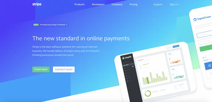
An excellent example of a website which builds on these principles while boldly diverging from them is Stripe. The splash page grabs your attention with an exciting semi-flat blue-green colour scheme shared with an amazing simple product demo. Information is presented concisely with a theme that gets more serious further down the page (less icons, much more text). There’s a link to more information in every message, tailoring the bottom of the page to people who to read more info, or want to be re-assured (list of clients). Rounding it off with a must-have action bar mimicking the first splash
Another great example of how simply following these principles is really effective is Monzo (monzo.com) and Prismic (https://prismic.io/). One of the most creative designs that sets its own principles is Magic Leap (https://www.magicleap.com/).
… and a mobile example
Daylio is an app that translates both the UX and UI principles into their mobile form. It’s lucid about its target users. It respects a younger audience whose app time is migrating to their web browser time. The KPI want to show as many users the value of the app as possible, and so looks to make as many users track their mood every day (therefore gaining availability of insightful graphs) which derives two problems:
- Triggering a use in the first place
- Having consistent use of the app
Actions and elements to solve these are shown throughout the two main pages:
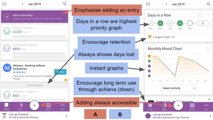
As part of its mission to give insight to the busy lives of users, Daylio enhances its UX via adding fun and forgiving mechanics. For every day, you can track your hobbies and the app incorporates this info into your feedback. A useful achievement mechanic overlaps targeting an increase in KPI and gamifying the app to make it more enjoyable to its target audience. It forgives you if you miss a day by allowing you to fill them out retrospectively all without losing your streak.
The colour scheme is not overloaded, its consistent, and well played. The app has its own icon set which is flat and has dashes of vibrant colours to represent moods. They have an iconic emoji set which has become the associating logo of the app. Entries and stats consistently convey information through cards meaning that carded advertisements fit perfectly without disturbing the flow - similar to Facebook.
Conclusion
User experience and design is simple. Know your user and you know your target. Know your target and you know your decisions. The simple and practical ways to implement these decisions go a long way. So next time you head into a product, you can do the following:
- Find examples of good design relating to your product
- Organise UI/UX workshops where your team can brainstorm a wireframe and user flow structure
- Apply these principles in the workshop and outside if there’s ever ambiguity in small details
- Make an amazing product and experience
Finally, don’t forget to stay MVP!