5 Gotchas using Victory Chart for Data Visualisation
Kamile Matulenaite7 min read
5 gotchas using Victory Chart for data visualisation
Victory Chart is a React chart library for data visualisation built on top of D3. Formidable Labs have produced a neat set of documentation - easy to follow, full of examples and an editable demo section (we love those!). However, there are a few things to watch out for when building custom charts with the library for the first time. After developing an e-commerce analytics dashboard from scratch, here are the gotchas that caught out my team in the early stages of the project.
1. Victory Chart container when using multiple datasets
The first few examples in the documentation gallery all use VictoryChart as a parent container. This is useful in the cases that we want to use a chart with one dependent axis and a single dataset.
The catch is that all children of a VictoryChart container must use the same domain. Therefore, if we want to define multiple dependent axes, with different domains, we have to combine components manually, using <svg> and <g> as opposed to VictoryChart as the container.
The <svg> element defines the viewport for our graph, and the <g> element is used to group together (‘g’ stands for group) other SVG elements: a set of VictoryChart components. Transformations defined in the <g> element are applied to every child in the container. In the example below, we shift each graph element down using translate(0, 40).
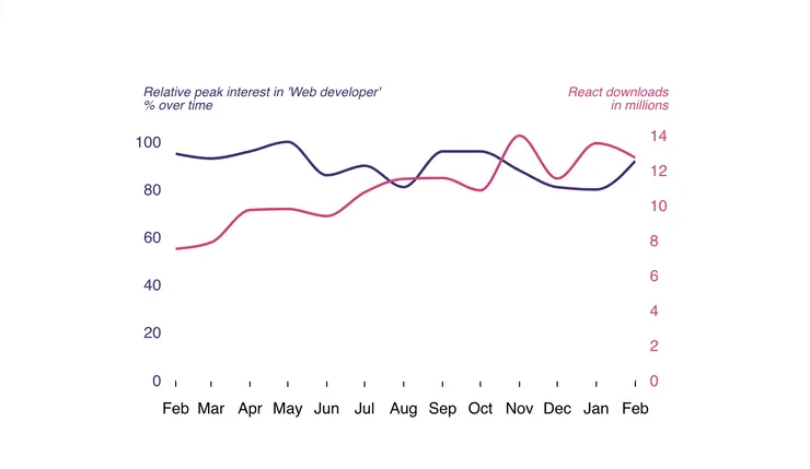 svg as parent container
<svg style={styles.parent} viewBox="0 0 450 350">
    <VictoryLabel x={25} y={75} style={styles.labelOne}
        text={"Relative peak interest in 'Web developer' \n % over time"}
    />
    <VictoryLabel x={425} y={75} style={styles.labelTwo}
        text={"React downloads\n in millions"}
    />
    <g transform={"translate(0, 40)"}>
        {/* Shared independent axis */}
        <VictoryAxis
            scale="time"
            standalone={false}
            style={styles.axisYears}
            tickValues={tickValues}
            tickFormat={date => date.toLocaleString('en-us', { month:'short' })}
        />
        {/* Dependent axis for data set one. */}
        <VictoryAxisdependentAxis
            domain={[0, 110]}
            offsetX={50}
            orientation="left"
            standalone={false}
            style={styles.axisOne}
        />
        {/* Dataset one */}
        <VictoryLine
            data={dataSetOne}
            domain={{
                x: [newDate(2018, 1, 1), newDate(2019, 1, 1)],
                y: [0, 110]
            }}
            interpolation="monotoneX"
            scale={{ x:"time", y:"linear" }}
            standalone={false}
            style={styles.lineOne}
        />
        {/* Dependent axis for data set two. */}
        <VictoryAxis dependentAxis
            domain={[0, 15000000]}
            orientation="right"
            standalone={false}
            style={styles.axisTwo}
            tickFormat={(x) => `${x / 1000000}`}
        />
        {/* Dataset two */}
        <VictoryLine
            data={dataSetTwo}
            domain={{
                x: [newDate(2018, 1, 1), newDate(2019, 1, 1)],
                y: [0, 15000000]
            }}
            interpolation="monotoneX"
            scale={{ x:"time", y:"linear" }}
            standalone={false}
            style={styles.lineTwo}
        />
    </g>
</svg>
2. Graph sizing
Charts using VictoryChart as a container are responsive and scale within the parent container while maintaining the aspect ratio defined by the height and width props.
When defining height and width in the VictoryChart container, these properties are passed down to the child components and override any height and width defined. So if you use <svg> as a container instead, the props must be passed to all children manually.
3. The standalone prop
This prop is important when layering a number of different graph types into one chart. By default, this prop is true, meaning that each component is rendered in an <svg>. By setting the prop to false, the component will be rendered in a <g> instead, so that we can layer different components in a group and apply common transformations.
For graph components inside the <svg> wrapper (such as VictoryStack this example), remember to set standalone to false so we can see the graph!
<svg style={styles.parent} viewBox="0 0 450 350">
    <VictoryLabel x={25} y={55} style={styles.labelOne}
        text={"Total Staff"}
    />
    <VictoryLabel x={25} y={65} style={styles.labelOne}
        text={"Devs +"}
    />
    <VictoryLabel x={65} y={65} style={styles.labelBizdevs}
        text={"Bizdevs"}
    />
    <VictoryLabel x={425} y={55} style={styles.labelTwo}
        text={"Total number of hires"}
    />
    <g transform={"translate(0, 40)"}>
        {/* Shared independent axis */}
        <VictoryAxis
            scale="time"
            standalone={false}
            style={styles.axisYears}
            tickValues={tickValues}
            tickFormat={date => date.toLocaleString('en-us', { month: 'short' })}
        />
        <VictoryStack standalone={false}>
            <VictoryArea
                data={dataSetThree}
            />
            <VictoryArea
                data={dataSetFour}
            />
        </VictoryStack>
        {/* Dependent axis for data set one. */}
        <VictoryAxis dependentAxis
            domain={[0, 35]}
            offsetX={50}
            orientation="left"
            standalone={false}
            style={styles.axisOne}
        />
        {/* Dependent axis for data set two. */}
        <VictoryAxis dependentAxis
            domain={[0, 5]}
            orientation="right"
            standalone={false}
            style={styles.axisTwo}
        />
        {/* Dataset two */}
        <VictoryLine
            data={dataSetTwo}
            domain={{y: [0, 5]}}
            interpolation="catmullRom"
            standalone={false}
            style={styles.lineTwo}
        />
    </g>
</svg>
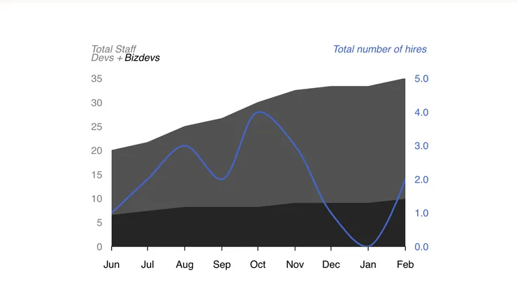 Remembering to use standalone
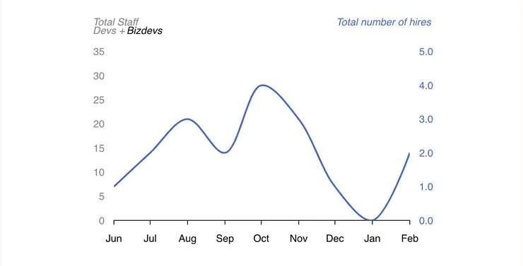 Forgetting to use standalone. No VictoryStack and no staff :-(
4. Domain matching
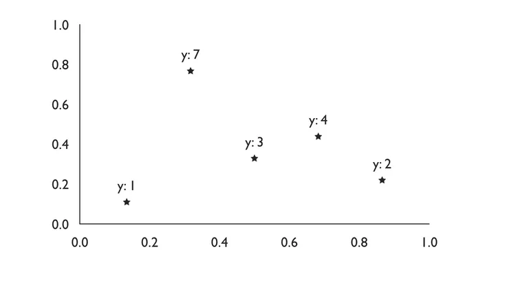
Setting the domain influences the range of the data components (bar, scatter, line etc). The domain is derived from the range of the given data by default, but sometimes we want to add extra space from the maximum value displayed in the graph and the top of the container (for example, if we want to add labels to each data point). The domain also influences the tick values, which are the value intervals displayed on the axis.
When defining multiple dependent axes using <svg> as a container, we need to set the domain for each VictoryAxis and each graph component (VictoryLine, VictoryScatter, VictoryBar etc) to ensure our axes are displaying the correct tick values corresponding to the data.
For example, a graph where the domain is not set:
<svg viewBox="0 0 450 350">
    <g transform={"translate(0, 40)"}>
        <VictoryAxis standalone={false}/>
        <VictoryAxis dependentAxis standalone={false}/>
        <VictoryScatter
            domainPadding={{x:50, y:50}}
            standalone={false}
            data={[
                {x:1, y:1, symbol: "star"},
                {x:2, y:7, symbol: "star"},
                {x:3, y:3, symbol: "star"},
                {x:4, y:4, symbol: "star"},
                {x:5, y:2, symbol: "star"}]}
            labels={(datum) => `y: ${datum.y}`}
        />
    </g>
</svg>
Note how the axis labels don’t correspond to the data values.
 Victory scatter plot with an
5. Domain padding
We define domain padding when we don’t want the first data value or zero to be placed in line with the axis. This is intuitive enough; we’re adding some padding between data elements and a domain. What is less clear, is that to align multiple datasets, we need to define the same domain padding in every child element.
Domain padding is also useful when creating bar charts. Each bar is centred around the given value by default, and a zero value may mean the bar will overlap the axis. In that case, domain padding may help to add space between the bar and the axis.
The following is the first example used in the documentation and shows that with no domain padding defined, the bars overlap the axes.
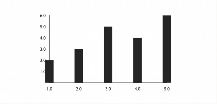 Simple bar chart example with no domain padding set.
<VictoryChart>
    <VictoryBar
        data={[
            { x: 1, y: 2 },
            { x: 2, y: 3 },
            { x: 3, y: 5 },
            { x: 4, y: 4 },
            { x: 5, y: 6 }
        ]}
    />
</VictoryChart>
Setting the domain padding in the VictoryChart container will add space between the first data point and the axis, where the prop will be passed to the VictoryBar child. When using multiple charts and datasets with an <svg> wrapper instead, then the domain padding has to be passed to each child separately.
Takeaways
Victory Chart is incredibly intuitive as a library for data visualisation when working with React. It is easy to define custom events on data elements, and easy to define interactive charts through the use of pre-built zoom and selection containers (which can also be extended).
If you’ve used Victory Chart before, hopefully you have learned something new. Otherwise, make sure you head over to their gallery to check out more of their cool examples. Finally, if you’re looking looking for data visualisation libraries for other JavaScript frameworks, you can find a good comparison here.