Build an awesome scrollable modal in React Native
Antoine Garcia4 min read
At some point during the development of your React Native application, you will use a Modal. A Modal is a component that appears on top of everything.
There are a lot of cool libraries out there for modals, so today, we’ll have a look a the best libraries for different use cases.
Click on “Tap to play” on the playground below to start:
You can experience the app on your phone here and check the code on github.
Before choosing a library, you have to answer those 2 questions:
- What do I want to display in the modal ?
- How great do I want the UX to be ?
To answer the 2nd question, we list a few criteria that make a good UX :
1️⃣ The user can click on a button to close the modal
2️⃣ The user can touch the background to close the modal
3️⃣ The user can swipe the modal to close it
4️⃣ The user can scroll inside the modal
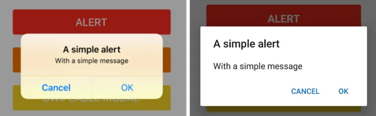
I) Alert
First, if you simply want to display some information and perform an action based on the decision of your user, you should probably go with a native Alert. An alert is enough and provides a much simpler and more expected UX. You can see how it will look like below.
II) Native modal
If you want to show more information to your user, like a picture or a customised button, you need a Modal. The simplest modal is the React Native modal. It gives you the bare properties to show and close the modal 1️⃣, so it is really easy to use ✅. The downside is that it requires some effort to customise so as to improve the user experience ❌.
import { Modal } from "react-native";
...
        <Modal
          animationType="slide"
          transparent={true}
          visible={this.state.modalVisible}
          onRequestClose={this.closeModal} // Used to handle the Android Back Button
        >
III) Swipeable Modal
If you want to improve the UX, you can allow the user to swipe the modal away. For example, if the modal comes from the top like a notification, it feels natural to close it by pulling it up ⬆️. If it comes from the bottom, the user will be surprised if they cannot swipe it down ⬇️. It’s even better to highlight the fact that they can swipe the modal with a little bar with some borderRadius. The best library for that use case would be the react-native-modal library. It is widely customisable and answers to criteria 1️⃣, 2️⃣ and 3️⃣.
import Modal from "react-native-modal";
...
        <Modal
          isVisible={this.state.visible}
          backdropOpacity={0.1}
          swipeDirection="left"
          onSwipe={this.closeModal}
          onBackdropPress={this.closeModal}
        >
IV) Scrollable modal
So far so good, now let’s see some more complex use cases. For instance, you may want the content of the modal to be scrollable (if you are displaying a lot of content or a Flatlist). The scroll may conflict with either the scroll of the modal or the scroll of the container of the Modal, if it is a scrollable component. For this use case, you can still use the react-native-modal library. You will have 1️⃣, 2️⃣ and 4️⃣. You can control the direction of the swipe with… swipeDirection.
import Modal from "react-native-modal";
...
        <Modal
          isVisible={this.state.visible}
          backdropOpacity={0.1}
          onSwipe={this.closeModal}
          // swipeDirection={"left"} <-- We can't specify swipeDirection since we want to scroll inside the modal
          onBackdropPress={this.closeModal}
        >
⚠️ Don’t try to combine swipeable + scrollable with this library. Instead continue reading…
V) Swipeable + Scrollable modal
The previous libraries are already awesome, but if you want your modal to answer criteria 1️⃣, 2️⃣, 3️⃣and 4️⃣, you need react-native-modalbox. This library is still very easy to use ✅and has everything out of the box ✅, and is listed in the awesome libraries by awesome-react-native. The only downside is that the modal from this library always appear from the bottom, and you can only swipe it down ❌.
import Modal from "react-native-modalbox";
...
        <Modal
          style={styles.container}
          swipeToClose={true}
          swipeArea={20} // The height in pixels of the swipeable area, window height by default
          swipeThreshold={50} // The threshold to reach in pixels to close the modal
          isOpen={this.state.isOpen}
          onClosed={this.closeModal}
          backdropOpacity={0.1}
        >
To avoid the collision between the scroll of your content and the swipe to close the modal, you have to specify swipeArea and swipeThreshold.
Conclusion
There are a lot of libraries built on top of the native modal. It is important to choose the right one depending on your needs. If you want to control the direction of the swipe, use react-native-modal, but if you want the modal to only come from the bottom, use react-native-modalbox.
The libraries I’ve talked about are amazing. Thanks to their contributors.
Please reach out if you think I missed something.