Your Preact Progressive Web App using Preact-CLI, Webpack, Material Design and Web APIs
Laurent Ros10 min read

This article will introduce you to the world of Progressive Web Apps, to the Preact framework and to Web APIs. It will guide you through 15 minutes of code to create your first Preact Progressive Web App!
Status of PWAs today
Progressive Web Apps are taking over the web! They are the future of desktop, mobile and native web applications. Multiple major companies are switching to PWAs for costs but also performance reasons: Twitter, Uber, l’Équipe…
But first, what is a Progressive Web App (PWA) ? A Progressive Web Application is a combination of the latest web technologies and good practices to implement. Most of the latter can be evaluated by the Lighthouse Chrome extension. And its extensive documentation will teach you a lot on how to improve you app.
Those practices will make your web application: Progressive, Responsive, Connectivity independent, App-like, Fresh, Safe, Discoverable, Re-engageable, Installable and Linkable. You can find a definition of each of those characteristics at Google’s. The combination of those characteristics result in one single web application that is lighter, faster to load, usable on any device, on low-quality networks and even offline. You can use the web framework of your choice and your app will be cross-platform and cross-devices. The most common frameworks for PWAs today are Angular, React, Vue.js and Ionic.
PWAs still suffer from a few limitations compared to native apps due to them being brand new. However, more and more Web APIs are announced at Google I/Os each year and Apple is now considering integrating one of the technologies that make up PWAs: the service workers.
Finally, even if you’re not aiming at replacing your native apps by a PWAs (yet!), implementing those good practices in your mobile and desktop web applications will help you drastically improve performances and maybe even positively impact your business. You can trust Algolia about its performance improvement and Google in its showcase for business impact.
This article is the first of a series that will show you how to create a new PWA from scratch using the Preact framework. Our final application will be a social media PWA where we can post photos that will be pinned on a map. The tutorial demonstrates how to use React packages in the Preact framework, and how easy it can be to use Web APIs in your PWA. The next parts in the series will teach you how to:
- Connect your app to Firebase using ReactFire
- Use the Geolocation Web API
- Add Google Authentication
- Set up the offline mode in your PWA
- Improve the performances
- Use push notifications
- …
We also started writing a series of awesome articles on how to build a PWA using Vue.js, Webpack, Material Design and Firebase: Part 1, Part 2 and Part 3.
Why Preact?

Preact is a tiny 3KB alternative to React, meaning it is super light and fast, and it packs up most of React’s features, including the same API! You can check this article for a quick comparison and an example of how to switch from React to Preact. Preact aims to offer high performance rendering with an optional compatibility layer (preact-compat) that integrates well with the rest of the React ecosystem such as Redux.
Preact is thus perfectly suited for desktop and more specifically mobile web-apps used with poor data connection, and therefore for Progressive Web Apps. Multiple renowned companies are now using Preact in production, such as Uber, Housing.com and Lyft. You can have a more exhaustive list of them here. Addy Osmani did a quick review of the performances of the Treebo PWA and wrote: “Switching from React to Preact was responsible for a 15% improvement in time-to-interactive alone”. Preact helped them “getting their vendor bundle-size and JS execution time down”.
Our goals in this article
By the end of this article, after 15 minutes of coding, we will have:
- A Progressive Web App based on Preact and webpack, scaffolded by preact-cli
- A map displayed by the google-maps-react React package (Google Maps API)
- A camera button (Material Design Lite)
- A camera modal triggered by the camera button (Camera Web API)
- The picture taken by the camera/webcam displayed on the map
Let’s code!
You can find the companion repository for this article here. I will also post the matching commits links along the article steps. However, I won’t linger on some commits related to code style and documentation. We will use yarn instead of npm in the examples. To install it you can refer to this page.
I wrote this article using the following versions:
- node v8.1.2
- preact v2.0.2
- yarn v1.0.1
Scaffold your app
To begin, we need to install preact-cli and create our project:
yarn add preact-cli
preact create default pinpic
cd pinpic
yarn install
yarn dev
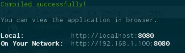
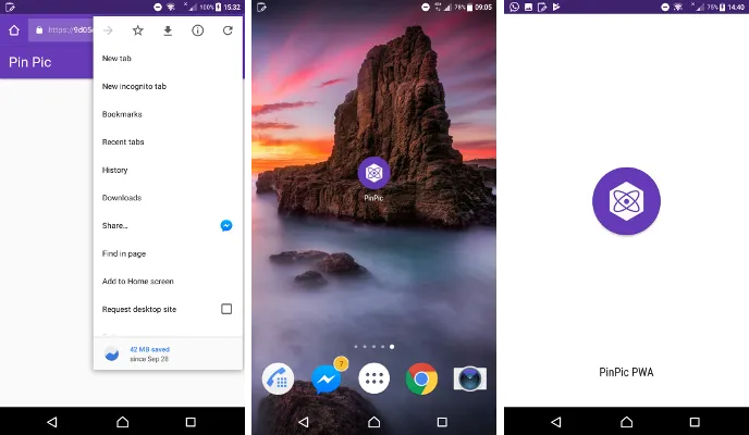
All this constitues our first commit. The project creation is pretty straightforward and won’t ask you anything other than the project name. After running yarn dev, you can now follow the link given to check the results of your developments in real-time on http://localhost:8080.
Check out the hot reload on your phone!
However the best way to visualize your new Preact Progressive Web App is still on your mobile device. If your phone is on the same network, you can use the address shown by the yarn dev command, http://192.168.1.100:8080 in our example above. Of course, you can also show off and share your PWA to your friends. For this purpose, I recommend you use ngrok. ngrok will expose your local environment and you will be able to access it on your phone. You can have a more thorough review of ngrok in Matthieu Auger’s article.
Install it and run it:
yarn global add ngrok
ngrok http 8080
The output should look like:
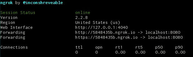
Browse on your phone to either link and you will be able to access your PWA.
It is now time for a bit of cleaning by removing some generated documentation and files (commit) and adding a Webpack alias to make PinPic refer to the src files (commit).
Update the manifest
We can now modify our src/manifest.json to update the name of our PWA (see this commit). The manifest.json is what makes a PWA installable and handles its display (if it’s seen like a normal web page in chrome, or in a standalone app). By default preact-cli makes our PWA standalone and makes it feel like a native app.
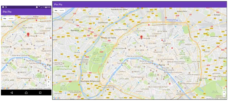
Display a map
To display a map in our app we will use the library google-maps-react. We will start by adding the package:
yarn add google-maps-react
You can now get a Google API key from the Google Developers website and put it in src/service/api.js:
export const GOOGLE_API_KEY = '<YOUR-GOOGLE-API-KEY>';
Our next step is to create a component in src/components/maps/index.js and add in it the lines of code from this section of the google-maps-react documentation. We also need to add the GOOGLE_API_KEY to our component (as specified in this section). In your src/components/maps/index.js, import the API key into a GoogleApiWrapper and import this new component into our src/components/app.js:
...
import { GOOGLE_API_KEY } from 'PinPic/service/api';
...
export default GoogleApiWrapper({
    apiKey: GOOGLE_API_KEY,
})(MapContainer)
...
import MapContainer from './maps';
...
    render() {
        return (
            <div id="app">
                ...
                <MapContainer />
            </div>
        );
    }
...
Your changes should look like this commit. Finally, we can fiddle around with the style (commit) to have the whole map displayed and not hidden by the header. Your app should now perfectly display a map as background of your app. Congratulations!
Material Design Lite and React Camera
Our goal is now to use the camera/webcam of your mobile/laptop and to access it by tapping a Material Design camera button. To do that, we now need to install two new packages:
yarn add preact-mdl
yarn add react-camera
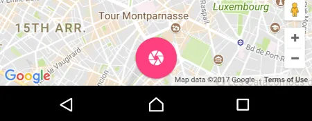
Add the Camera Button
Let’s first add the Material Design Camera button centered at the bottom of our app. From the preact-mdl package documentation we get the two links to the stylesheets. We can then import the button and icon we want along with the Material Design stylesheets. We also add some style to have it centered at the bottom of our page. In our src/components/app.js, add (commit):
...
import { Button, Icon } from 'preact-mdl'
...
                <div className="buttonContainer">
                    <Button
                        fab
                        colored
                        raised
                        onClick={this.toggleCameraModal}
                    >
                        <Icon icon="camera"/>
                    </Button>
                </div>
                <link rel="stylesheet" href="https://fonts.googleapis.com/icon?family=Material+Icons" />
                <link rel="stylesheet" href="https://code.getmdl.io/1.2.1/material.indigo-pink.min.css" />
...
...
.buttonContainer {
    position: absolute;
    bottom: 0;
    padding: 10px;
    display: flex;
    align-items: center;
    width: 100%;
}
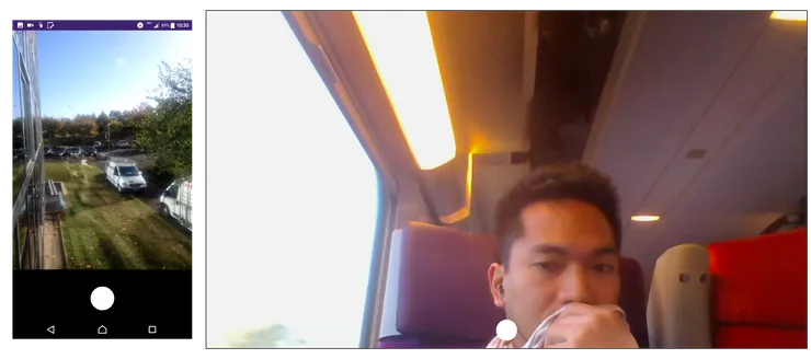
Create and display the Camera Modal
Our app now needs a modal to display the media stream from our webcam/camera. This modal will be our new component src/components/cameraModal/index.js, created from the content of this section of the react-camera documentation. Copy it and replace import React, { Component } from 'react'; by import { Component } from 'preact'; and App by CameraModal (commit). We can then import it in src/components/app.js.
...
import CameraModal from './cameraModal';
...
    render() {
        return (
            ...
            <CameraModal />
            ...
        )
    }
You can now see the CameraModal open at any time.
Make the Camera Button toggle the Modal
On our app, we now have a CameraButton that does nothing and a CameraModal that displays the video stream from our webcam/camera. The next step is to have the CameraButton toggle on and off the CameraModal. In src/components/app.js, we create a state property isCameraModalOpen set to false by default and a function toggleCameraModal that will toggle this state. Those two are to be passed to the CameraModal component. Now, in src/components/cameraModal/index.js, we handle those two new props and create a hideModal() method to manage the style of the modal (commit).
...
export default class App extends Component {
    constructor(props) {
        super(props);
        this.setState({
            isCameraModalOpen: false,
        })
        this.toggleCameraModal = this.toggleCameraModal.bind(this);
        this.setPicture = this.setPicture.bind(this);
    }

    toggleCameraModal() {
        const isCameraModalOpen = this.state.isCameraModalOpen;
        this.setState({
            isCameraModalOpen: !isCameraModalOpen
        });
    }
    ...
    render() {
        return (
            ...
            <CameraModal
                isModalOpen={this.state.isCameraModalOpen}
                toggleCameraModal={this.toggleCameraModal}
            />
        )
    }
    ...
}
...
export default class CameraModal extends Component {
    constructor(props) {
        ...
        this.hideModal = this.hideModal.bind(this);
    }
    ...
    hideModal() {
        return this.props.isModalOpen ? {top: 0, opacity: 1} : {top: '100vh', opacity: 0}
    }
    ...
    render() {
        return (
            <div
                style={{
                    ...style.container,
                    ...this.hideModal()
                }}
            >
                ...
            </div>
        )
    }
    ...
}
Your button now toggles the CameraModal on and off. I added some style to have a smoother toggle (commit) and added prop-types checks on the CameraModal (commit). I ended with a bit of code cleaning by moving the style of the components inline (commit).
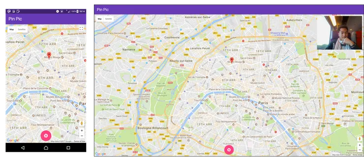
Display Taken Picture
The last step of our app is now to save and display the picture taken. In src/components/app.js, we create a method setPicture that will save the picture blob in an objectURL. We then pass this method to the CameraModal.
We also display the picture on the top right of the map (commit).
Now use this method in src/components/cameraModal/index.js:
...
export default class App extends Component {
    constructor(props) {
        ...
        this.setPicture = this.setPicture.bind(this);
    }
    ...
    setPicture(picture) {
        this.img.src = URL.createObjectURL(picture);
    }
    ...
    render() {
        return (
            <div style={styles.app}>
            ...
                <div style={styles.mapContainer}>
                    <img
                        style={styles.picture}
                        ref={(img) => {
                            this.img = img;
                        }}
                    />
                    ...
                </div>
                <CameraModal
                    ...
                    setPicture={this.setPicture}
                />
            </div>
            ...
        )
    }
}

const styles = {
    ...
    picture: {
        top: 10,
        right: 10,
        position: 'absolute',
        zIndex: 10,
        height: 200,
    },
    ...
}
...
export default class CameraModal extends Component {
    ...
    static propTypes = {
        ...
        setPicture: PropTypes.func,
    }
    ...
    takePicture() {
        ...
        .then(blob => {
            this.props.setPicture(blob)
        });
        ...
    }
}
You can also remove the following lines of code from src/components/cameraModal/index.js, since it has been moved to src/components/app.js:
...
<img
    style={style.captureImage}
    ref={(img) => {
        this.img = img;
    }}
>
...
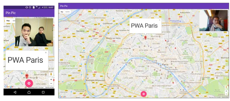
Awesome! You now have your own Preact Progressive Web App that displays a map and its pinpoints, allows you to take a picture through the webcam/camera of your device and displays it.
Conclusions
This tutorial allowed us to discover preact and to see how quick it can be used to develop a small but powerful PWA from scratch.
- We created a Preact and webpack based Progressive Web App backbone using one command
- We used the Google Maps API to display a map as background of our app
- We added a Material Design camera button
- We used the Camera Web API to take a picture and display it
If you are in Paris and interested in PWAs, I am co-organizing the Paris Progressive Web Apps Meetup once every month. Don’t hesitate and join us!