How I stopped worrying and learned to love the CSS with BEM
Albéric Trancart10 min read
CSS coding should not be a pain in the neck. At some point, most developers notice that they avoid writing CSS and that it has an impact on their efficiency and on the code quality, which is unacceptable.
It recently happened to me so I decided to tackle this issue. I stopped, took a deep breath and I dived, crawling the Internet looking for a solution.
I eventually found one, and I never despised CSS ever since. In fact, I rewrote the entire CSS stylesheet of my main personal project (its design is entirely custom) and I achieved a 50% drop in CSS lines count and number of classes, in addition to increasing maintainability, reusability and code quality.
In this article, I will cover these subjects:
- Why CSS is important
- How to avoid common mistakes
- How to structure your code with the OOCSS and BEM methodologies
- Which best practices I used and I recommend
This article will serve you well if you code your CSS from scratch but it will also help you if you use frameworks like Bootstrap (let’s face it, you can not do everything with a styling framework). I assume that you are using a preprocessor so the LESS syntax will be used in the examples.
Why you should care about CSS
CSS with preprocessors like LESS and SASS is a great tool. But remember: “With great power comes great responsibility”. Having powerful tools like design patterns and awesome frameworks does not mean you will use them without running into trouble. Doing bad, bad, bad things is super easy with CSS and preprocessors. Even if you say “ok, this time I will do it better”, if you do not have some quality standards you will keep writing messy CSS. Let’s see why:
- Like any language, CSS should be reusable, maintainable and scalable. Adding CSS properties on top of each other in order to fix a problem will break these three rules.
- Ever seen plentiful padding/margin/color declarations in every CSS class? You know what I’m talking about. The code should not be duplicated.
- Ever used
!importantbecause you needed it to fix a previously applied CSS rule? You know it’s wrong. Why are you still doing it? Fix the problem at the source. - Keeping your specificity low (we’ll talk about it later) will speed up CSS rendering and maintainability.
Dealing with selectors
First of all, you must have a good understanding of what specificity is. Here is a nice definition :
Specificity determines which CSS rule is applied by the browsers. If two selectors apply to the same element, the one with higher specificity wins.
The rules to win the specificity war are:
- Inline style beats ID selectors. ID selectors are more specific than classes and attributes (
::hover,::before…). Classes win over element selectors. - A more specific selector beats any number of less specific selectors. For instance,
.listis more specific thandiv ul li. - Increasing the number of selectors will result in higher specificity (
.list.linkis more specific than.list). - If two selectors have the same specificity, the latest declared rule wins.
!importantoverrides normal declarations, duplicating all specificity levels, leading to eight categories in the selectors hierarchy.
Here is a good website to compute the specificity of a selector: Specificity Calculator. Try it with your own selectors! Now that we fully understand specificity, here are some best practices:
Have decoupled selectors
Separating your selectors is a good idea. For instance, if you have this markup:
<div class="alert danger">...</div>
You should style it with:
/* GOOD */
.alert {
  font-weight: bold;
}
.danger {
  color: red;
}
/* BAD */
.alert.danger {
  font-weight: bold;
  color: red;
}
Decoupling selector will not only increase maintainability and scalability: it will speed up the rendering. Most web browsers are caching first-level selectors. .alert and .danger will be cached but not .alert.danger!
Keep your specificity low
In short, avoid downward selection like hell. With a sufficient amount of CSS, you would end up using inline styles. For instance, this is a very bad selector:
#hellobar a.hellobar_cta.hb-button {
}
In addition to the non-meaningful class names, how would you overwrite a rule set by this selector? Using !important, inline style or just another class, maybe?
To avoid future complication and refrain your inclination to go down in the specificity hell, you should follow these rules:
- Use only classes. If you limit yourself to classes you will never dig that deep. The first thing that you learn in CSS is: “never do inline style”. Same here.
- Never use
!importantto go downward. The only correct way to use!importantis to ensure upward specificity. Here is a good example: danger should always be red, no matter what happens.
.danger {
  color: red !important;
}
Don’t mess with HTML or Javascript
Every language exists for a reason and is an autonomous, meaningful entity. CSS is for styling. HTML is for meaning. Javascript is for manipulation.
- Never style IDs. It is too specific and impossible to reuse. IDs should only be used as anchors or as Javascript selectors.
- On the contrary, you should never use classes as Javascript selectors, because that would mean that you couldn’t reuse a CSS class. Use IDs or data-attributes instead.
- Never style HTML elements. For me, that was the hardest part of the learning curve because it went against everything I had done before. HTML should be meaningful: using a DOM element for styling is a bad practice. Imagine you had a
.clickableclass which displays a specific color and a custom pointer on hover. You could apply it like this:
<a class="clickable"></a>
<li class="clickable"></li>
<tr class="clickable"></tr>
<h3 class="clickable"></h3>
This is particularly useful for single page apps using custom routing links or for a resource that is accessible on click, without page change. If you have a user input (like a text coming from a WYSIWYG textarea), consider making an exception:
.user-input {
    a { .clickable; }
    h1 { .big; }
    kbd { .code; }
}
It is also a good practice to write style-first DOM. Provided you have a nice grid system (flexbox is great), you might consider ordering your properties like this:
- Grid-related attributes.
- Classes (with two white spaces between each class for better readability).
- HTML attributes.
- Other custom attributes.
For instance, if I have an AngularJS app:
<a flex="50" class="btn btn-default" href="..." title="..." ng-if="..."></a>
The first step to heaven: OOCSS
If there is one word to describe OOCSS, it is reusability. What is OOCSS?
OOCSS means Object-Oriented CSS. The goal is to find repeated visual patterns and to factorize them when possible. .big-title is better than .main-title while .links-list is prefered to .articles-menu.
Bootstrap was the first great impulsion towards OOCSS. See for yourself:
<a class="btn btn-default btn-lg"></a>
Some properties are factorized in the .btn class, reducing code size and speeding up rendering.
But OOCSS has some downsides: sometimes the need is too specific, you can’t address with factorized objects. For instance, building a monolithic web app with an original design is merely impossible with OOCSS only.
Furthermore, it is very difficult to foresee what piece of code will be reused because OOCSS relies on visual patterns and you don’t have any when starting a web app from scratch.
The BEM structure
BEM is a method published in 2010 by Yandex. It means Block Element Modifier. It relies on the fact that every web page or web app can be exploded into blocks, elements and modifiers.
The BEM syntax is a bit specific. The official naming convention is:
.block {
}
.block--modifier {
}
.block__element {
}
.block__element--modifier {
}
Here is a short example which sums up the entire BEM concept:
.Person {
}
.Person--blind {
}
.Person__head {
}
.Person__hand {
}
.Person__hand--left {
}
.Person__hand--right {
}
(I like to start class names with a capital letter because it ensures that the name is not already in use by a vendor like Bootstrap)
BEM Blocks
A block is an autonomous entity, a component of the web app. An app can be represented as Block Tree. For instance, here is an excerpt from the official BEM website:
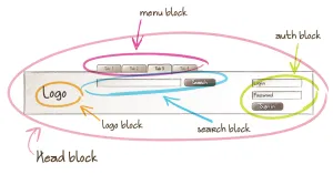
A block can even be reused across websites and most of all it has its own context. Which means that higher or lower blocks in the Block Tree will not affect the display of the current block.
To achieve this, positioning rules and BEM blocks should be totally decoupled. A Block class should not contain rules such as float, margin or width.
The main advantage of this is that blocks can be moved across the website without worry. An interesting property is that, as a consequence, blocks can be included recursively. Imagine building a Reddit-like comment tree:
<div class="CommentBox">
  [... Text ...]
  <div class="CommentBox">
    [... Text ...]
    <div class="CommentBox">
      [... Text ...]
    </div>
  </div>
  <div class="CommentBox">
    [... Text ...]
  </div>
</div>
If blocks and positioning rules are properly decoupled, you win!
This is particularly powerful when used in combination with components-based frameworks: AngularJS directives, ReactJS components…
BEM Elements and Modifiers
An element is a part of a block. Thus it uses the block context. That’s why there is a reminder before the element name:
.block__element {
}
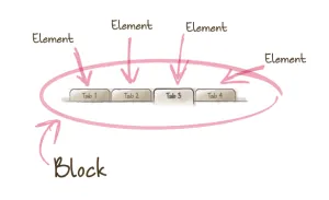
Blocks being autonomous entities, elements can and should be positioned inside them. Modifiers are classes used to propose alternative versions of a block or an element. The following example could be described by this markup:
<nav class="Navbar">
  <a class="Navbar__tab">Tab 1</a>
  <a class="Navbar__tab">Tab 2</a>
  <a class="Navbar__tab  Navbar__tab--active">Tab 3</a>
  <a class="Navbar__tab">Tab 4</a>
</nav>
Preprocessors are really useful:
.Navbar {
    ... rules ....

    &__tab {
        ... rules ....

        &--active {
            ... rules ....
        }
    }
}
Elements can also be positioned blocks:
<div class="Search">
  <input class="Search__input  Input" />
  <button class="Search__button  Button"></button>
</div>
Suggested CSS architecture
Now that you have all of this in mind, how to structure your CSS (or LESS/SASS files)? There is no absolute guideline but here is a suggested file tree:
style
├── bootstrap.less
├── components
│   ├── button.less
│   ├── link.less
│   ├── navbar.less
│   └── ...
├── objects
│   ├── colors.less
│   ├── grid.less
│   ├── typo.less
│   └── ...
├── resets
│   ├── fonts.less
│   ├── html.less
│   ├── vendor.less
│   └── ...
└── themes
    ├── theme1.less
    ├── theme2.less
    └── ...
- If you consider theming (theme files defining colors then including the bootstrap file), your favorite build system could build all files in the
themesfolder into separate minified CSS files. If theming is not important, you can delete this folder and directly build the bootstrap file. - The bootstrap file should load the resets then the objects then the components.
- Reset files are here to wipe out unwanted stylings such as text-decoration on links, title margins or vendor classes.
- Objects are OOCSS classes and mixins reusable everywhere:
.small,.big,.padded… with this, you could unify all your padding values, your font sizes, etc. - Components are entire BEM contexts: blocks with their elements and modifiers.
With this, you could easily reuse bits of code and components for your other websites. Creating your own styling framework is at a hand and it is not that difficult!
Conclusion
With OOCSS and BEM, I began to enjoy CSS. Before, it was more drudgery than anything else.
With OOCSS and BEM, the code is more structured, reusable, and you have that feeling that you’re doing it right. Which is, in my opinion, the most important thing because you will be more efficient and produce better quality code.
Sources and inspirations: